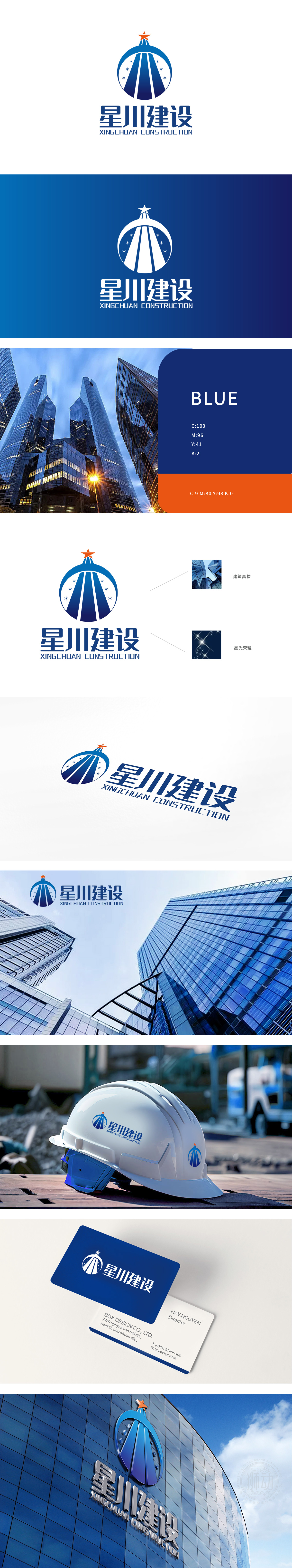
狮动设计用元素说「建筑故事」,红色自带权威感与行动力,像一盏「指引灯」,既呼应了「星川」的「星」字,又暗示企业在行业中的引领地位;蓝色圆形主体用了渐变蓝,蓝是建筑行业的「信任色」,代表专业、可靠,圆形则传递「包容、完整」的企业格局,像一个「能量场」,又像「生长的力量」,完美对应了建筑企业「拓展、延伸」的业务属性;整体通过五角星代表「目标与引领」,圆形代表「全面与包容」,放射条纹代表「发展与扩张」,蓝色代表「专业与信任」——这些元素组合起来,构建了一个「有实力、有远见的建筑企业」。
Lion design uses elements to tell "architectural story", and red has its own sense of authority and action, like a "guiding lamp", which not only echoes the word "star" of "Xingchuan", but also implies the leading position of enterprises in the industry; Gradual blue is used as the main body of the blue circle, which is the "trust color" of the construction industry, representing professionalism and reliability, while the circle conveys the "inclusive and complete" enterprise pattern, like an "energy field" and a "growth force", which perfectly corresponds to the business attributes of the construction enterprise "expansion and extension".


扫码或拨打添加客服微信


