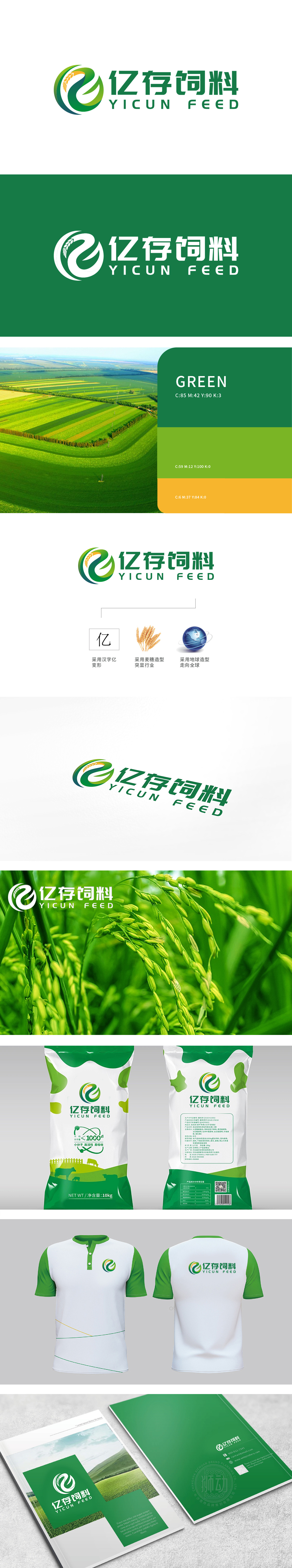
狮动设计采用黄色部分像麦穗的颗粒,直接点出饲料行业的核心原料,一眼就让人联想到“饲料来自优质谷物”的信任感;绿色曲线则像麦秆的舒展,又像循环的箭头,既强化了“农业、自然”的行业属性,还暗含“可持续发展”的隐含寓意;更妙的是,整个图形保留了“亿”字的辨识度,把品牌名称“亿存”直接“画”进了LOGO里,不用文字也能让人联想到品牌名,这就是设计的“视觉记忆点”!把复杂的品牌信息“简化”成了能快速识别的图形。
Lion design uses yellow grains like wheat ears to directly point out the core raw materials of feed industry, which reminds people of the trust that "feed comes from high-quality grain" at a glance; The green curve is like a stretch of wheat straw and a circular arrow, which not only strengthens the industrial attributes of "agriculture and nature", but also implies the implied meaning of "sustainable development"; Even better, the whole figure retains the recognition of the word "100 million", and the brand name "100 million" is directly "painted" into the LOGO.


扫码或拨打添加客服微信


