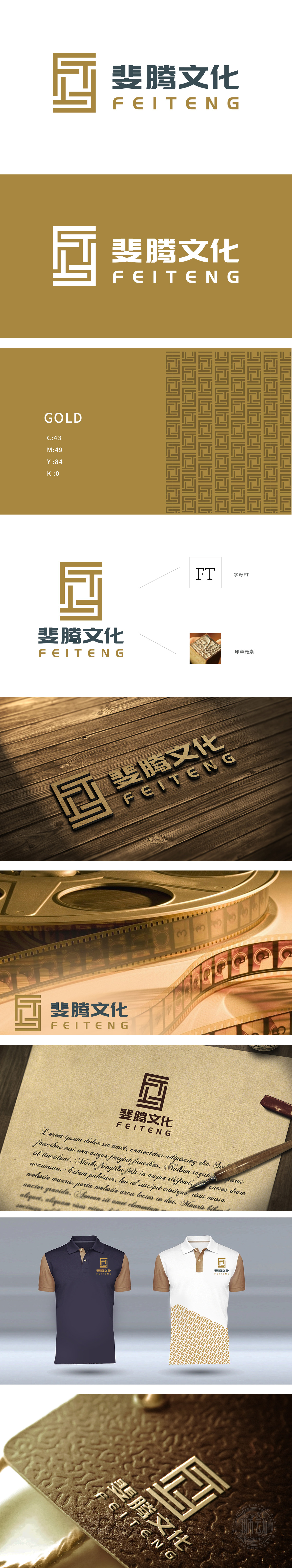
狮动设计采用“回”字纹作为中国传统纹样的经典代表,象征“循环、传承”,暗合“斐腾文化”“文化传播者”的定位;几何化的变形,则赋予其现代感与极简美,避免了传统纹样的“厚重感”,更符合娱乐行业的“轻量化”传播需求,金色作为主色调,既传递了高端感,又呼应了“文化”的“经典性”(如黄金般持久的文化价值);通过“传统与现代的融合”“视觉与业务的匹配”“创意与逻辑的统一”,完美展现了既有文化底蕴,又有娱乐精神”的设计。
Lion design adopts the word "Hui" as the classic representative of China traditional patterns, symbolizing "circulation and inheritance", which coincides with the positioning of "Feiteng culture" and "cultural disseminator"; Geometrical deformation gives it a sense of modernity and minimalist beauty, which avoids the "heavy feeling" of traditional patterns and is more in line with the "lightweight" communication needs of the entertainment industry. As the main color, gold not only conveys a sense of high-end, but also echoes the "classicality" of "culture" (lasting cultural value like gold).


扫码或拨打添加客服微信


