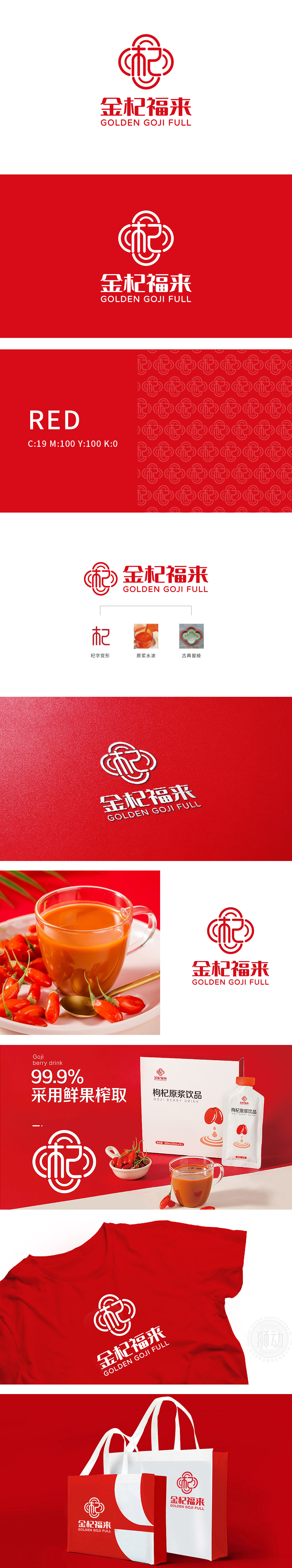
狮动设计以“杞”字为视觉核心,通过简化笔画、圆形环绕的设计,将汉字转化为品牌符号。直接点出产品的核心原料(枸杞),简洁易记,符合现代保健品品牌“直观、亲切”的传播需求。流畅的线条像液体流动,直观传递“新鲜、浓稠、鲜活”的产品质感,窗棱的“通透感”暗示产品的“纯粹无添加”,符合消费者对保健品“安全、天然”的期待。每一笔都在“说产品”,每一处都藏着“巧思”,完美诠释了“视觉即语言”的设计智慧。
Lion design takes the word "Qi" as the visual core, and transforms Chinese characters into brand symbols by simplifying the design of strokes and circles. Directly point out the core raw material of the product (Lycium barbarum), which is simple and easy to remember, and meets the communication needs of modern health care products brands that are "intuitive and friendly". The smooth lines flow like liquid, intuitively conveying the product texture of "fresh, thick and lively", and the "transparency" of the window edge implies that the product is "purely additive".


扫码或拨打添加客服微信


