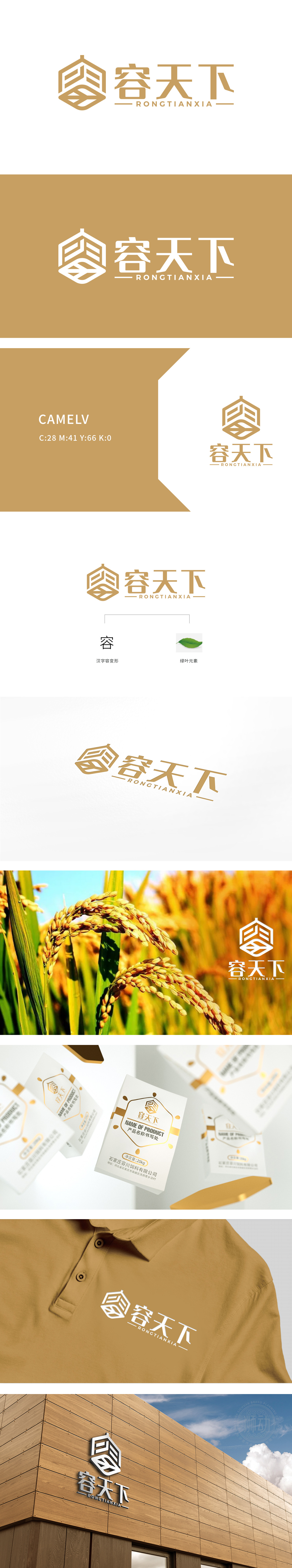
狮动设计以纯白色为基底,传递干净、专业的行业属性;通过金色的华贵感提升品牌调性——"白+金"的组合既保留了农业产品的"接地气",又通过金属色的点缀打破,完美契合"容天下"品牌"包容、大气"的命名理念。采用六边形作为logo与产品名称的载体,几何图形自带"稳定、坚固"的心理暗示,同时六边形的"多边性"也呼应了"容天下"的"包容"概念多面接纳,用几何图形传递"理性、可靠",用装饰元素传递"温度、活力",将产品的"功能性"与品牌的"情感性"完美融合。
Lion design is based on pure white, conveying clean and professional industry attributes; Enhance brand tonality through golden luxury-the combination of "white+gold" not only retains the "grounding gas" of agricultural products, but also breaks through the embellishment of metallic colors, which perfectly fits the naming concept of "tolerance and atmosphere" of "tolerance to the world" brand. Hexagons are used as the carrier of logo and product names, and the geometric figure has its own psychological hint of "stability and firmness". At the same time, the "multilateralism" of hexagons also echoes the multi-faceted acceptance of the concept of "tolerance" of "accommodating the world".


扫码或拨打添加客服微信


