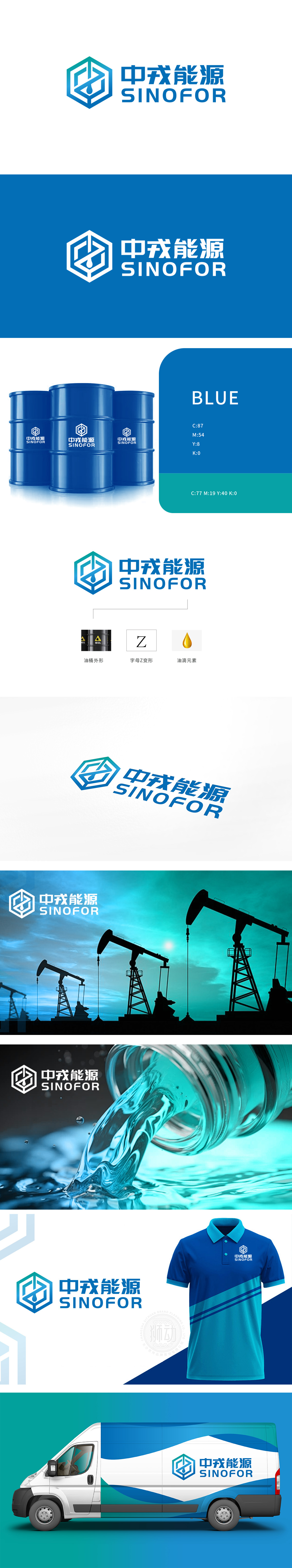
狮动设计将油桶作为石油行业最经典的视觉标签,而是把它揉进了六边形的几何框架里——六边形本身自带“稳固、科技、规律”的属性,刚好契合能源公司“可靠、专业、现代”的品牌形象。油滴的形状和周围的Z形、油桶轮廓形成了呼应:Z的折线刚好“框住”油滴,把“石油”从“抽象概念”变成了“可感知的视觉符号”,让logo瞬间有了“灵魂”。油桶的轮廓裹着Z字的折痕,折痕里坠着一滴金亮的油滴,每一笔都像在说:“我懂石油,更懂怎么让石油‘开口说话’。”,我是“一家专业、可靠、有价值的石油能源公司。
Lion Design regards oil drums as the most classic visual label in the oil industry, but rubs them into the geometric framework of hexagons—the hexagons themselves have the attributes of "stability, technology and regularity", which just fits the brand image of energy companies as "reliable, professional and modern". The shape of the oil drop echoes the Z-shape and the outline of the oil barrel around it: the zigzag line of Z just "frames" the oil drop, changing the "oil" from an "abstract concept" to a "perceptible visual symbol" and giving the logo a "soul" in an instant. The outline of the oil drum is wrapped in a Z-shaped crease, and a drop of jinliang oil drops falls in the crease.


扫码或拨打添加客服微信


