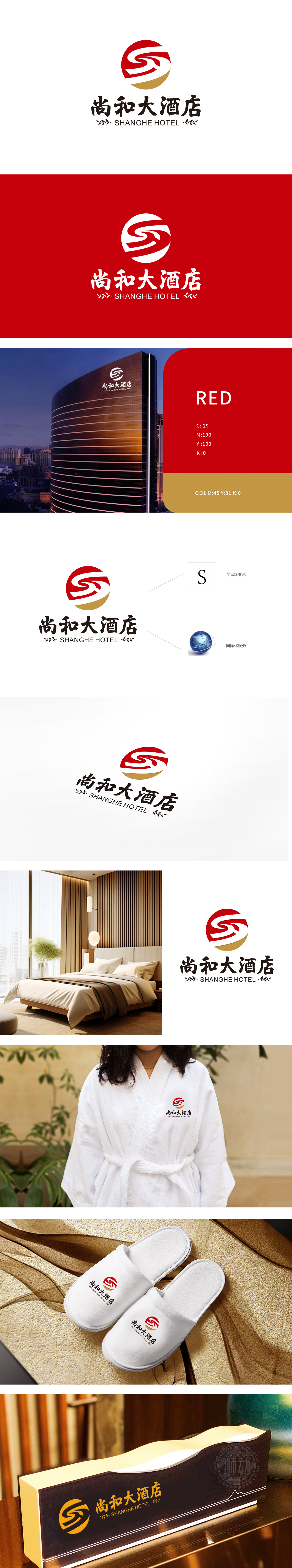
狮动设计通过「曲线拉伸+断笔处理」将静态首字母转化为「流动的丝带」,又赋予符号「动感、鲜活」的视觉感受,符合酒店「接待服务」的行业属性。红色圆形基底象征「圆满、喜庆」,底部点缀金色弧边则提升了LOGO的「高端感」,传递出现代、舒适、高端的酒店形象,为旅客提供“和谐、舒适、高端”的居住体验。
Lion Design transforms the static initials into "flowing ribbon" through "curve stretching+pen breaking treatment", and gives the symbol a "dynamic and vivid" visual feeling, which conforms to the industry attribute of hotel reception service. The red circular base symbolizes "completeness and happiness", and the bottom embellished with golden arc edges enhances the "high-end feeling" of LOGO, conveying a modern, comfortable and high-end hotel image and providing a "harmonious, comfortable and high-end" living experience for tourists.


扫码或拨打添加客服微信


