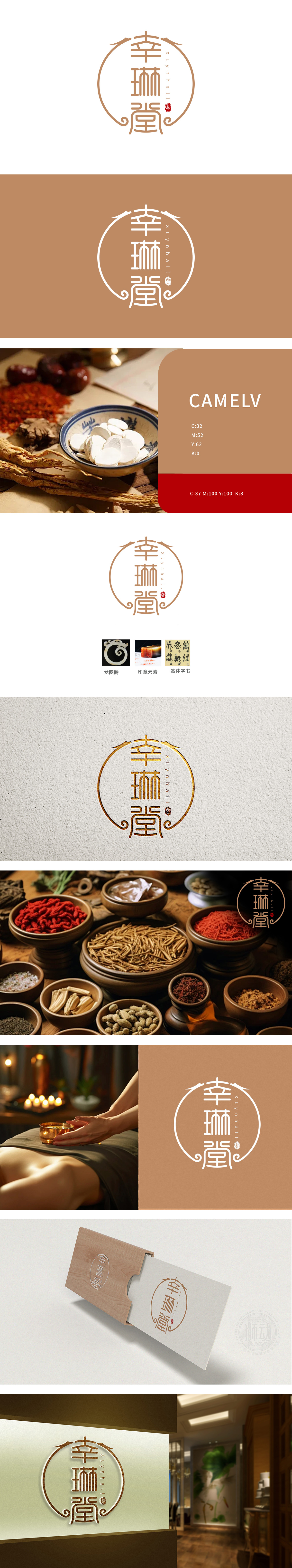
狮动设计以传统底蕴为视觉载体,融入品牌名幸琳堂,”采用小篆字体,笔画匀整、结构方正,自带“古雅、庄重”的文化质感。篆体字的“复古感”不仅强化了品牌的“传统养生”属性,更让消费者直观联想到“中医典籍、老药铺”等信任符号,符合养生品牌“传承、可靠”的认知需求。龙图腾:生命力与平衡的象征,龙在中国文化中是“活力、权威、吉祥”的代表:龙作为“中华民族的图腾”,更能引发消费者对“民族养生文化”的情感共鸣。龙图腾(自然崇拜)、篆体字书(四季规律)、椭圆形边框(阴阳平衡),共同传递了中医“天人合一”的核心理念,实现了“视觉美感”与“品牌价值”的统一。
Lion Design takes the traditional visual carrier, and Xing Lin Tang uses the small seal script, with even strokes and square structure, and brings its own "quaint and solemn" cultural texture. The "retro feeling" of seal characters not only strengthens the brand's "traditional health preservation" attribute, but also makes consumers intuitively associate with trust symbols such as "Chinese medicine classics, old drugstore", which meets the cognitive needs of health preservation brands for "inheritance and reliability". Dragon totem: a symbol of vitality and balance. Dragon is the representative of "vitality, authority and auspiciousness" in China culture.


扫码或拨打添加客服微信


