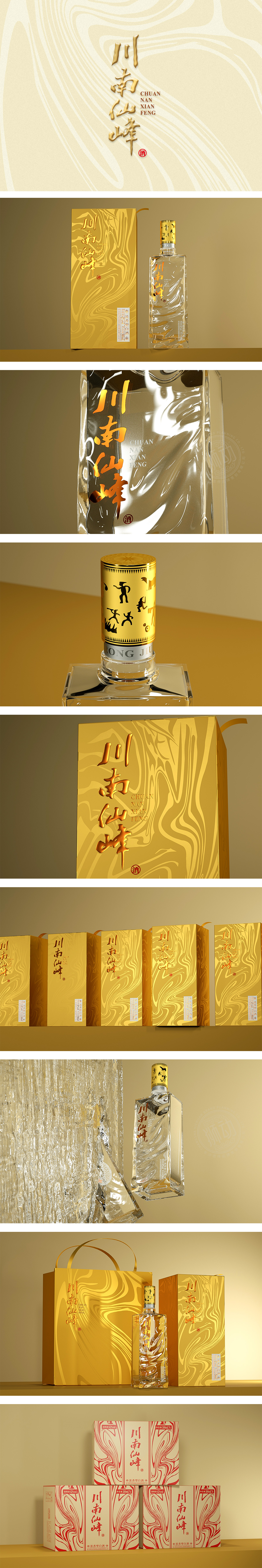
狮动设计以鎏金色为主色调,金色在传统文化中对应“尊贵”,符合“仙峰”所暗示的“稀缺性”;鎏金的光泽感,增加了“温润感”,更符合“川南”的地域性格(内敛、厚重);与透明瓶身的“清透感”形成对比(金→白→金),视觉上形成“聚焦-呼吸-强化”的节奏,让“酒液本身”成为隐性主角。用“流动感”讲活“酒的故事”,从“视觉”到“触觉”(鎏金的质感、瓶身的曲线),从“静态”到“动态”(纹理的流动感),每一个细节都在“强化记忆”——让消费者看到包装,就能联想到“川南的山、流动的水、醇厚的酒”。
Lion design is dominated by gilded gold, which corresponds to "dignity" in traditional culture and conforms to the "scarcity" implied by "Xianfeng"; The luster of gilding adds a "moist feeling", which is more in line with the regional character of "South Sichuan" (restrained and heavy); In contrast to the "clear feeling" of the transparent bottle (gold → white → gold), the rhythm of "focusing-breathing-strengthening" is formed visually, making "the wine itself" a hidden protagonist. Tell the story of wine with a sense of fluidity, from "vision" to "touch" (the texture of gilding and the curve of the bottle body), from "static" to "dynamic" (the sense of fluidity of the texture).


扫码或拨打添加客服微信
