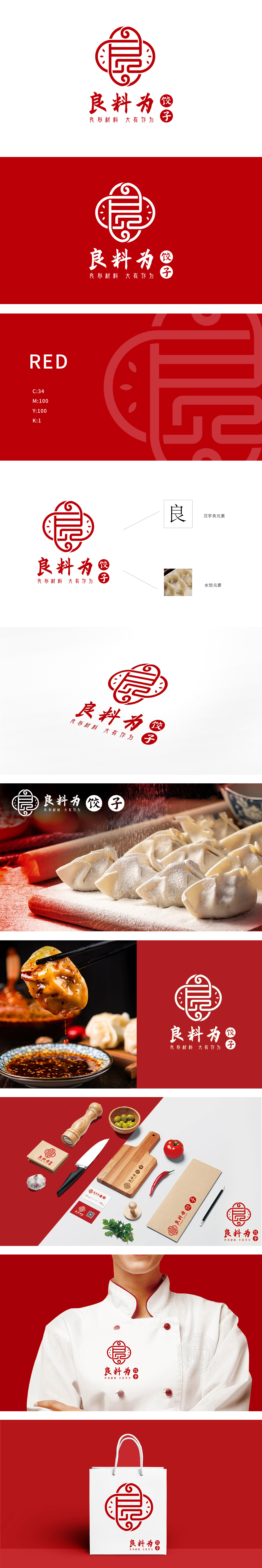
狮动设计将「良」字(品牌核心:良料、良心)与中国结(传统符号:团圆、圆满)进行了巧妙融合:中国结的圆形轮廓与对称结构,暗合「团圆饭」的场景属性,红色主色调的选择,既是中国传统喜庆色,也能刺激食欲,同时呼应「饺子」出锅时的热气腾腾感。用「符号+文字+具象」三重维度绑定「水饺」,用「良」字贯穿始终,强化信任度,「既有审美高度,又有商业逻辑」的设计,确实值得佩服。
Lion design skillfully combines the word "Liang" (brand core: good material and conscience) with Chinese knot (traditional symbol: reunion and perfection): the circular outline and symmetrical structure of Chinese knot coincide with the scene attribute of "reunion dinner", and the choice of red main color is not only a traditional festive color in China, but also can stimulate appetite, and at the same time echo the steaming feeling of "jiaozi" when cooking.


扫码或拨打添加客服微信


