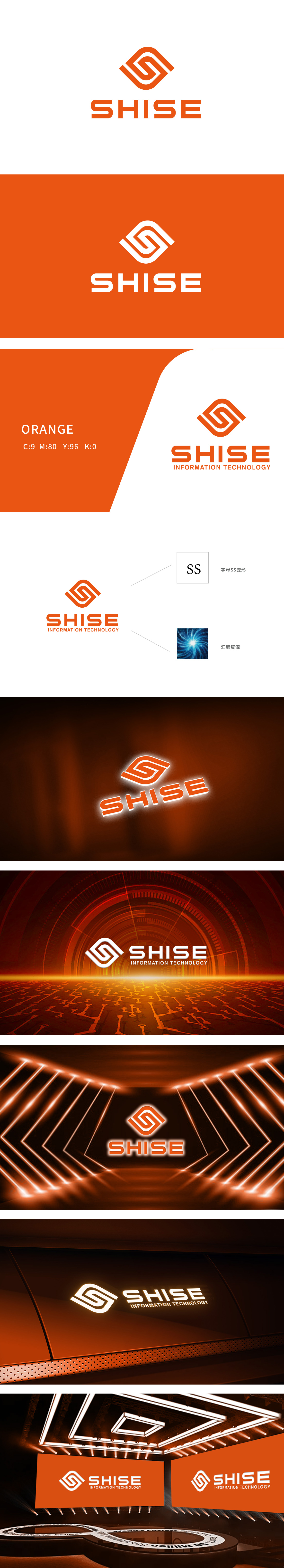
狮动设计由两条流畅的橙色线条缠绕而成,形成类似(无限)结构,同时隐含**"S"字母**的形态,线条的缠绕感与动态趋势,传递出"连接""循环""持续创新"的科技属性,橙色作为主色,既保留了红色的活力与紧迫感,又具备黄色的明亮与希望感,完美匹配科技公司"创新、积极、可信赖"的品牌形象。整体设计用字母变形解决了"品牌辨识度"问题;用视觉隐喻解决了"理念传递"问题;用色彩与布局解决了"视觉美感"与"信息效率"问题橙色吸引注意,层级清晰。
Lion Design is formed by winding two smooth orange lines, which forms a similar (infinite) structure, and at the same time implies the shape of the letter **"S ".The winding sense and dynamic trend of the lines convey the scientific and technological attributes of" connection ","circulation "and" continuous innovation ".As the main color, orange not only retains the vitality and urgency of red, but also has a sense of brightness and hope of yellow, which perfectly matches the scientific and technological company". The whole design solves the problem of "brand recognition" with letter deformation.


扫码或拨打添加客服微信


