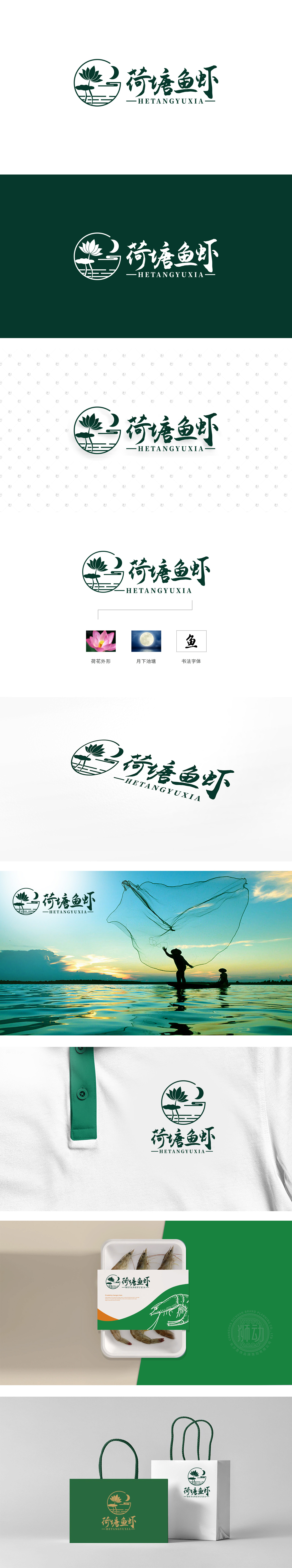
狮动设计用「荷塘场景」锚定生鲜的「原生感」,LOGO主体是一个圆,里面揉合了荷花、弯月、水波纹三个元素——这简直就是“月下荷塘”的具象化!荷花是荷塘的“灵魂符号”,直接关联“鱼虾生长的环境”:荷叶的舒展、莲花的挺拔,都在暗示荷塘水质清澈、生态良好,而这样的环境里养出的鱼虾,自然带着“新鲜、无污染”的原生属性;弯月+水波纹的组合,把“荷塘的夜晚”搬了进来:月光洒在水面的涟漪,营造出一种“静谧、自然”的氛围,瞬间戳中消费者对“原生态生鲜”的期待;整体用「场景化设计」连接消费者的「感官记忆」,每一个元素都在诉说 产品的鲜活。
Lion design uses the "lotus pond scene" to anchor the fresh "original feeling". The main body of the LOGO is a circle, in which three elements of lotus, crescent moon and water ripple are mixed-this is simply the concretization of "lotus pond under the moon"! Lotus is the "soul symbol" of the lotus pond, which is directly related to the "environment in which fish and shrimp grow": the stretching of lotus leaves and the straightness of lotus suggest that the water quality of the lotus pond is clear and the ecology is good, and the fish and shrimp raised in such an environment naturally have the original attributes of "fresh and pollution-free".


扫码或拨打添加客服微信


