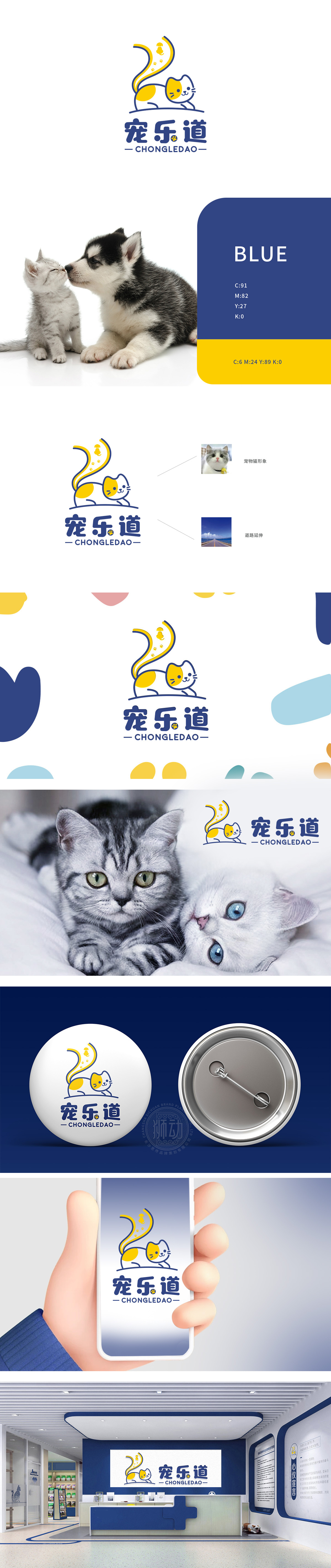
狮动设计以线条简化的猫为核心,脸上带着软萌的微笑,黄色斑块覆盖背部与脸颊——这种设计完美贴合了宠物主人对“可爱、治愈”的需求。猫的尾巴上有爪印+小狗图标,用宠物符号传递“全宠类”的产品定位;整体线条圆润无棱角:符合“安全、温和”的食品属性,让主人联想到“给宠物吃的东西,必须柔软放心”。猫尾形似道路,象征“陪伴与延续”:暗示品牌希望成为宠物成长路上的“伙伴”,整体设计用“符号化+语义化”的设计语言,把宠物食品的“核心诉求”(可爱、安全、陪伴)翻译成了易懂的视觉符号。
Lion design takes the cat with simplified lines as the core, with a soft and cute smile on the face and yellow patches covering the back and cheeks-this design perfectly fits the needs of pet owners for "cuteness and healing". There are paw prints and puppy icons on the cat's tail, and pet symbols are used to convey the product positioning of "all pets"; The overall line is round and angular: it conforms to the food attribute of "safety and gentleness" and reminds the owner that "the food for pets must be soft and secure". The cat's tail is shaped like a road, symbolizing "companionship and continuity".


扫码或拨打添加客服微信


