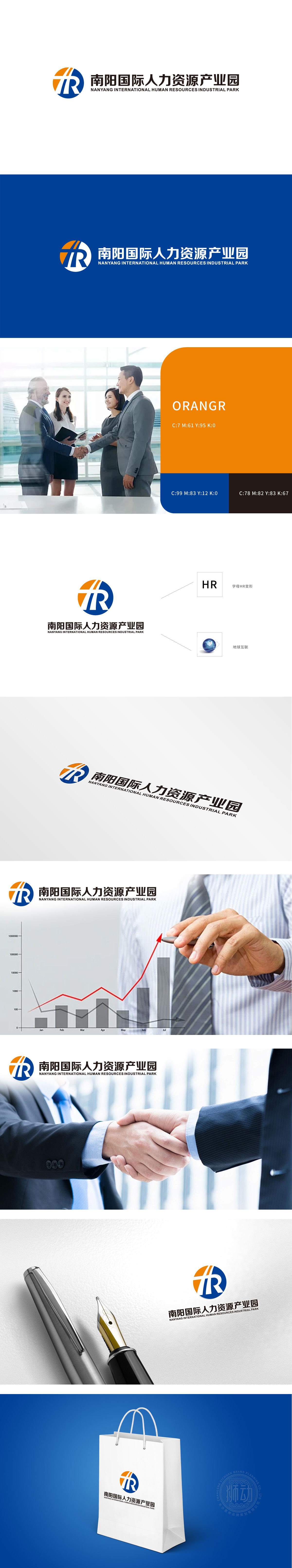
狮动设计采用HR字母变形,“H”以橙色竖条+白色分隔线构成,既保留了字母的辨识度,又赋予“支撑、发展”的隐喻;“R”以蓝色曲线收尾,与“H”的直线形成对比,曲线的流动感模拟“连接、传递”的动作传递搭建桥梁”的核心价值;圆形本身象征“完整、包容、全球化”,与“国际产业园”的“国际”属性强关联;用抽象图形呼应“国际人才流动、全球资源整合”的定位。整体把握了“国际人力资源产业园”的核心——连接(人才与企业、本地与全球),用视觉语言把抽象的“产业定位”变成了可感知的“符号记忆。
Lion design adopts the variation of HR letter, and the "H" is composed of orange vertical bar and white separation line, which not only retains the recognition of letters, but also gives the metaphor of "support and development"; "R" ends with a blue curve, which is in contrast with the straight line of "H". The fluidity of the curve simulates the core value of "connecting and transmitting" to build a bridge; The circle itself symbolizes "integrity, tolerance and globalization" and is strongly related to the "international" attribute of "international industrial park".


扫码或拨打添加客服微信


