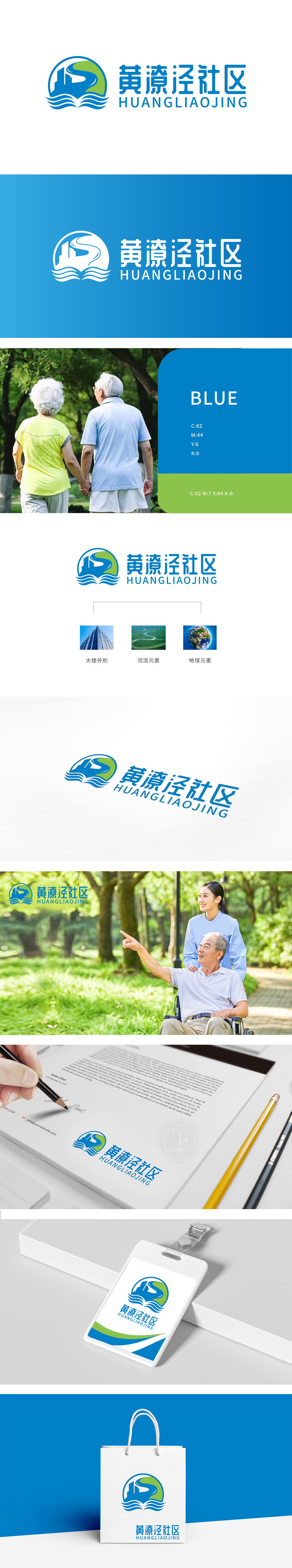
狮动设计以「圆形」为基底,象征社区的「和谐完整」;「大楼外形」采用蓝色极简线条,既代表社区的「物理空间」,又似「张开的怀抱」,传递包容感;「绿色S形曲线」是「河流元素」的抽象化流畅的线条打破了圆形的规整,增添了灵动性;「蓝色波浪线」则强化了「水」的意象,与河流元素形成「呼应链」,让图形更有层次感。色彩上:蓝(稳重、可靠)与绿(生机、环保)的搭配,既符合社区「宜居」的定位,又传递出「可持续」的理念,整体用图形语言诠释了「小社区,大格局」的内涵。细节里的「归属感」与「责任感」,「颜值」与「温度」的完美平衡。
Lion design is based on "circle" and symbolizes the "harmony and integrity" of the community; The "building shape" adopts blue minimalist lines, which not only represents the "physical space" of the community, but also resembles "open arms" to convey a sense of tolerance; "Green S-shaped curve" is the abstraction of "river element". The smooth lines break the regularity of the circle and add agility. The "blue wavy line" strengthens the image of "water" and forms an "echo chain" with river elements, making the figure more layered. In terms of color, the combination of blue (stable and reliable) and green (vigorous and environmentally friendly) not only conforms to the orientation of "livable" in the community.


扫码或拨打添加客服微信


