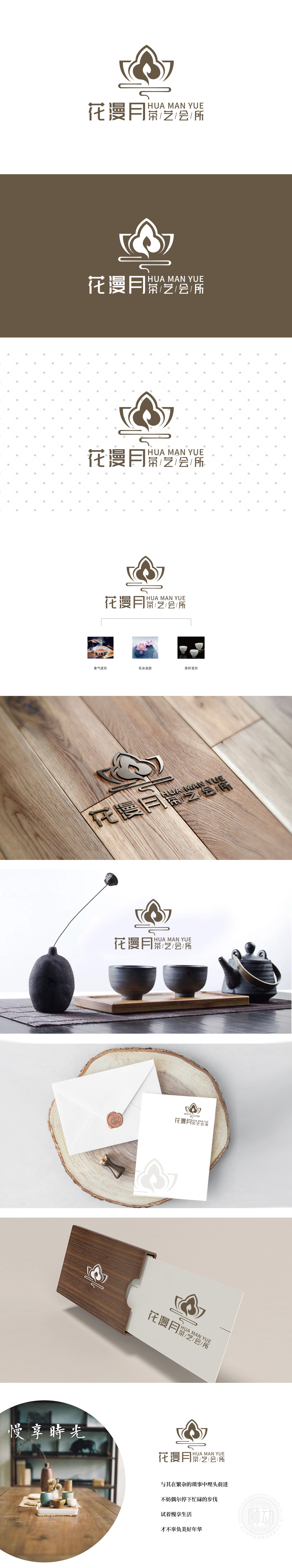
狮动设计通过图形抽象、元素融合与逻辑闭环,将“茶”“花”“香”的核心意象拆解重组,最终呈现出既具禅意又富现代感的品牌视觉语言,每一处细节都透露出对“形”与“意”的极致把控。核心视觉由“花朵造型”“香气变形”“茶杯简化”**三大元素叠加而成,花朵造型(莲花):以极简的几何线条勾勒出五瓣莲花的轮廓,花瓣采用渐变的浅棕色调,既保留了莲花“高洁、禅意”的传统文化符号属性,。花瓣的弧度经过刻意调整,边缘微微向外舒展,似绽放的姿态,传递“生机”与“雅致”,呼应“花漫月”中“花”的意象。曲线的弧度流畅自然,从莲花中心向上升起,打破了静态花朵的沉闷,赋予LOGO“活”的气息,暗合茶艺“动态过程”(备茶、冲茶、闻香)的特点。整体风格:传统文化与现代设计的“完美共情”。
Lion Design dissembles and reorganizes the core images of "tea", "flower" and "fragrance" through graphic abstraction, element fusion and logical closed loop, and finally presents a brand visual language with Zen and modernity, and every detail reveals the ultimate control of "shape" and "meaning". The core vision is composed of three elements: flower modeling, aroma deformation and cup simplification. Flower modeling (lotus): the outline of five-petal lotus is outlined with minimalist geometric lines, and the petals are gradually light earthy tones, which not only retains the traditional cultural symbol attributes of lotus, but also keeps the purity and Zen. The radian of the petals has been deliberately adjusted, and the edges are slightly stretched outward, like a blooming gesture, conveying "vitality" and "elegance" and echoing the image of "flowers" in "flowers over the moon".


扫码或拨打添加客服微信


