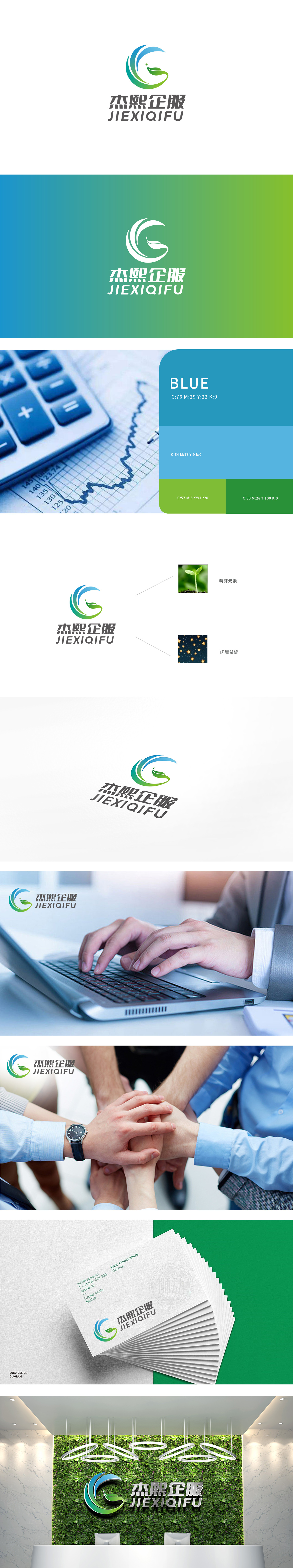
狮动设计用符号讲“企服”故事,logo的核心视觉由流动波浪、成长叶片、星点亮点三大元素构成,每一处设计都紧扣“企服”的核心诉求——助力客户成长:流动波浪:曲线构成的波浪造型具有强烈的动态感,既象征“服务的流畅性”,也隐喻“企业的发展性”,传递“与客户共成长”的品牌理念。星点亮点:叶片尖端的小星点如“点睛之笔”,既代表“创新”,也象征“焦点”,让logo多了一层“有温度的专业”。完美平衡了商务的严谨与服务的温度。
Lion design tells the story of "enterprise service" with symbols. The core vision of logo is composed of three elements: flowing waves, growing blades and star lighting points. Every design is closely related to the core demand of "enterprise service"-helping customers grow. Flowing waves: the wave shape composed of curves has a strong sense of dynamics, which not only symbolizes "the fluency of service" but also symbolizes "the development of enterprises" and conveys "growing together with customers" Star lighting point: the small star point at the tip of the blade.


扫码或拨打添加客服微信


