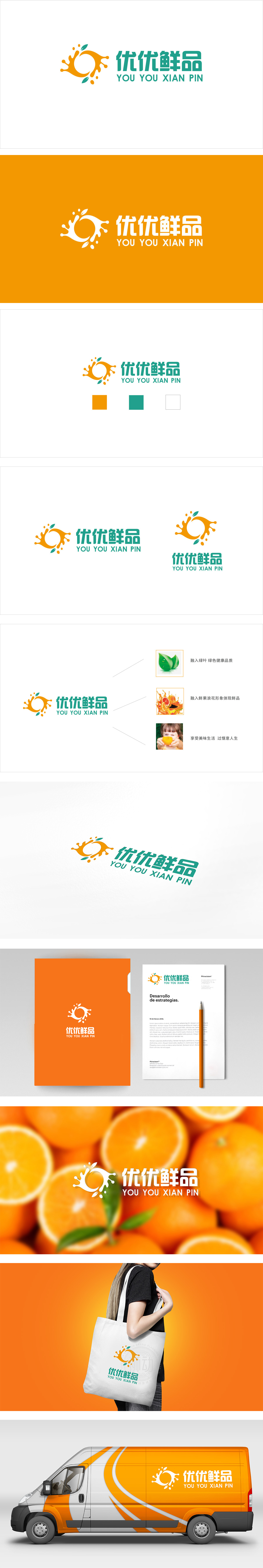
狮动设计采用橙色果汁飞溅的圆形:像一杯刚榨好的鲜果汁,飞溅的细节模拟了水果被切开时的汁水迸发,瞬间传递“新鲜到爆”的感官刺激;圆形又自带“圆满、亲切”的属性,符合生鲜品牌“给家人选好货”的温暖感。点缀的绿叶:用少量绿色平衡了橙色的活泼,既呼应了“健康果蔬”的品类特征,符合大众对“新鲜食材”的心理预期(新鲜=带点绿)。“优优鲜品”的汉字用了圆润的字体,笔画简洁柔和,像刚摘的蔬菜叶子一样“清爽”;把“品牌要讲的话”变成了“消费者能看懂的画”。
Lion design adopts a round shape of orange juice splashing: like a cup of freshly squeezed fresh juice, the splashing details simulate the juice generate when the fruit is cut, and instantly convey the sensory stimulation of "fresh to bursting"; The round shape also has the attribute of "perfection and kindness", which is in line with the warmth of fresh brand "choosing good goods for family". Decorated green leaves: a small amount of green balances the liveliness of orange, which not only echoes the category characteristics of "healthy fruits and vegetables", but also conforms to the public's psychological expectation of "fresh ingredients" (fresh = with a little green).


扫码或拨打添加客服微信


