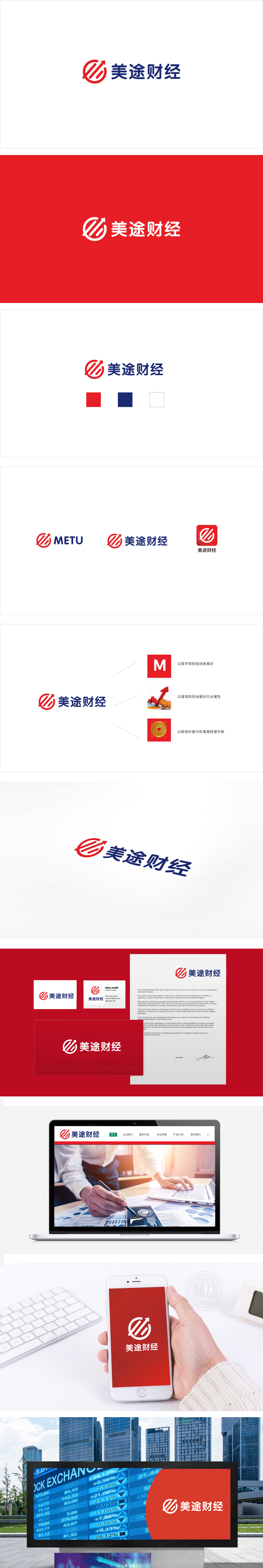
狮动设计以红色圆环+向上箭头的组合,既像「滚动的齿轮」(象征业务的持续运转),又像「上升的漩涡」(隐喻财富的聚集与增长),更巧妙的是,圆环的「开口设计」打破了「固化」感,暗示「开放、包容、持续进化」的品牌态度——这对财经品牌来说,意味着「不墨守成规,能适应市场变化」。对「投资者」而言,蓝色字体传递「可靠」,红色图形传递「增长」,组合起来就是「我能帮你实现稳健的财富增长」;通过「颜色的情绪管理」「形状的隐喻设计」「空间的节奏把控」,让logo成为了「品牌的视觉代言人」。
Lion design is a combination of a red ring and an upward arrow, which is both like a "rolling gear" (symbolizing the continuous operation of business) and a "rising vortex" (implying the accumulation and growth of wealth). More cleverly, the "opening design" of the ring breaks the sense of "solidification" and implies the brand attitude of "openness, tolerance and continuous evolution", which is for financial brands. For investors, blue fonts convey "reliability" and red graphics convey "growth", which together means "I can help you achieve steady wealth growth"; Through the emotional management of color.


扫码或拨打添加客服微信


