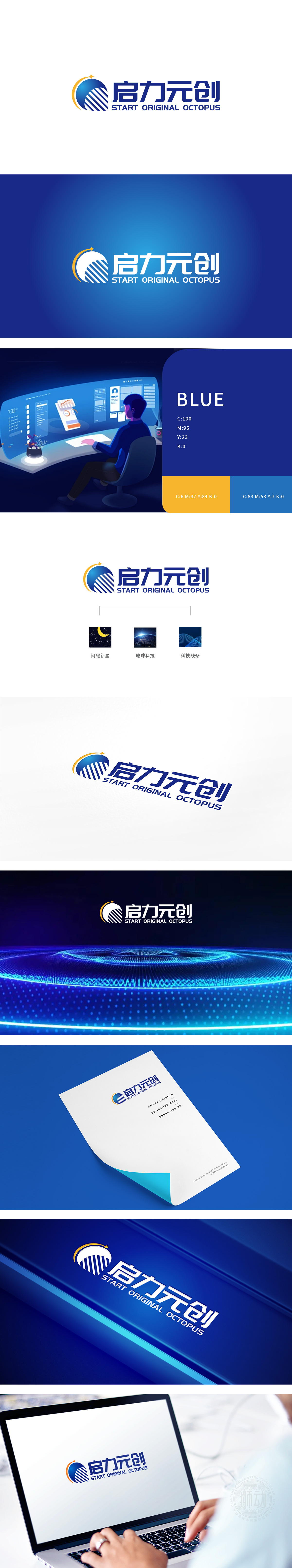
狮动设计以「蓝色半圆」(象征科技的包容与专业)为基底,叠加「黄色弧线」(注入活力与创新感)、「微小星点」,星点的「微小」与半圆的「宏大」形成对比,强化「闪耀新星」的品牌定位。 这种「少即是多」的设计,恰恰体现了狮动对「图形传递效率」的深刻理解——用最少的元素,讲最清晰的品牌故事,用逻辑化构建实现视觉统一,传递「全球布局」与「科技赋能」的品牌愿景。
Lion Design is based on the blue semicircle (symbolizing the inclusiveness and professionalism of science and technology), and is superimposed with the yellow arc (injecting vitality and innovation) and tiny star points. The tiny star points are in contrast with the grandeur of the semicircle, and the brand positioning of Shining Star is strengthened. This "less is more" design just reflects Lion Motion's profound understanding of "graphic transmission efficiency"-telling the clearest brand story.


扫码或拨打添加客服微信


