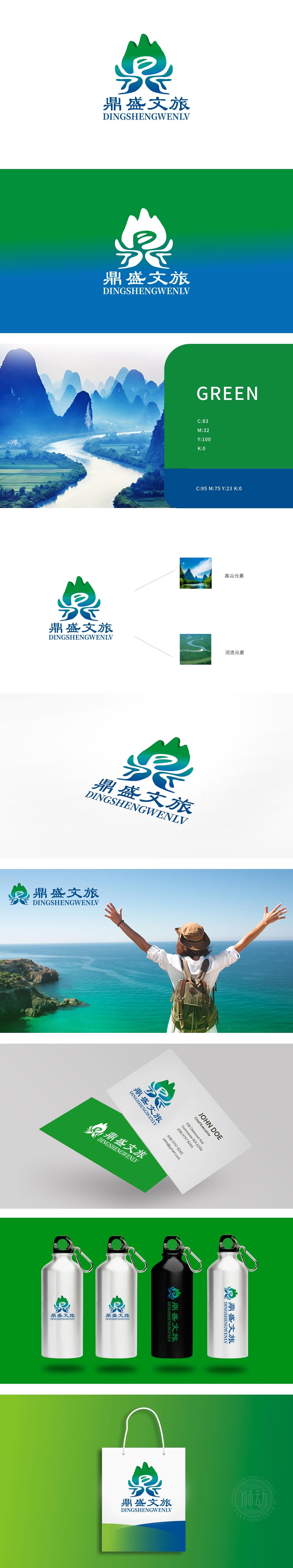
狮动设计将自然元素的艺术化与图形融合,高山元素的提炼:LOGO顶部的绿色渐变形态“高山元素”图,传递出“生态、清新、原生”的旅游体验感。河流元素的转译:既象征着河流的灵动与包容,又与高山元素形成“刚柔并济”的视觉平衡;蓝色的冷静感则强化了“可靠、舒适”的旅游服务属性。颜色与字体的协同,完美贴合“文旅”品牌的“自然+人文”定位——绿色代表自然景观的生机,蓝色代表文化服务的底蕴;图形与旅游服务的深度关联,场景化的品牌传达。
Lion design combines the artistry of natural elements with graphics, and refines alpine elements: the green gradient form of "alpine elements" at the top of LOGO conveys the sense of "ecological, fresh and original" tourism experience. Translation of river elements: it not only symbolizes the agility and tolerance of rivers, but also forms a "rigid and flexible" visual balance with mountain elements; The blue sense of calmness strengthens the attribute of "reliable and comfortable" tourism service.


扫码或拨打添加客服微信


