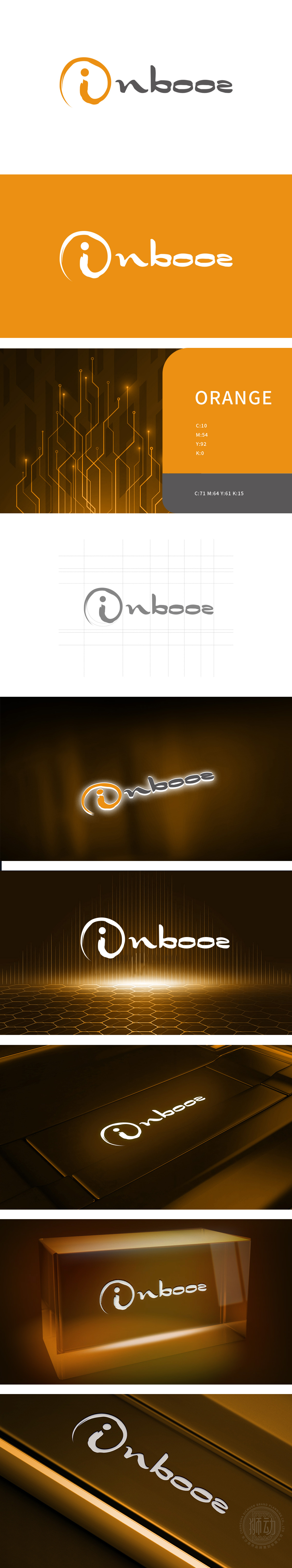
狮动设计以橙色圆形为基底(橙色象征创新、活力与科技感),内部嵌套一个拟人化的“i”形,(“i”是信息的经典符号),传递“数据服务于人”的理念;圆形则寓意“完整、循环、整合”,同时增强了视觉的凝聚力。字母“nbooe”: 采用灰色圆润字体(灰色代表专业、冷静与科技质感),字体线条流畅无棱角,暗示“数据的流动性”,直接点出电子数据领域的“信息传递者”角色。用简洁语言传递丰富行业信息,色彩与符号构建差异化视觉体系。
Lion design is based on orange circle (orange symbolizes innovation, vitality and sense of science and technology), and an anthropomorphic "I" shape is nested inside ("I" is a classic symbol of information) to convey the concept of "data serving people"; The circle symbolizes "integrity, circulation and integration" and at the same time enhances the visual cohesion. Letter "nbooe": It adopts a rounded gray font (gray stands for professionalism, calmness and scientific texture), and the font lines are smooth without edges and corners, implying "data fluidity" and directly pointing out the role of "information transmitter" in the field of electronic data.


扫码或拨打添加客服微信


