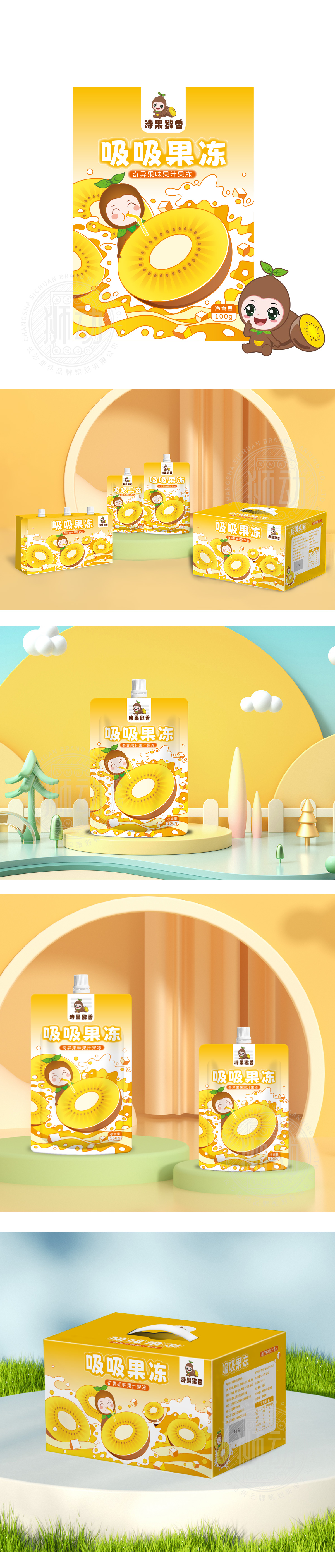
狮动设计用“具象符号”还原果冻的“感观体验”,通过拟人化图形+动态化细节,把“Q弹、多汁、新鲜”的抽象感受变成可视觉化的符号:放大的猕猴桃切片,用高饱和度的明黄色+深褐色+白色(果芯)的分层设计,强化“真实水果原料”的信任感;切片边缘的“波浪纹”模拟果冻的“弹性质感”,仿佛用手能捏出Q弹的触感。拟人化的“猕猴桃圆滚滚的身体、头顶的猕猴桃叶、眯眼吸果冻的表情(传递“好吃到眯眼”的满足感)、用“拟人化”降低距离感,让产品更像“小朋友的玩伴”,而非冰冷的食品。把果冻的“本质属性”变成了能“看得到、摸得着、想得到”的图形,这种“具象化+情感化”的图形语言,让消费者不用读文字就能“懂”产品,甚至能“联想到吃它的快乐”,用视觉解决“认知效率”,用情感建立“品牌记忆”。
Lion Design uses "figurative symbols" to restore the "sensory experience" of jelly, and changes the abstract feeling of "Q-bomb, juicy and fresh" into a visual symbol through anthropomorphic graphics and dynamic details;Enlarged kiwifruit slices are layered with high saturation bright yellow+dark brown+white (fruit core) to strengthen the trust of "real fruit raw materials"; The "wavy lines" on the edge of the slice simulate the "elastic texture" of jelly, as if you can pinch the touch of Q-bomb with your hands. The anthropomorphic "round body of kiwifruit, kiwifruit leaves on the top of the head, squint at the expression of sucking jelly (conveying the satisfaction of" delicious to squint "), and using anthropomorphism to reduce the sense of distance make the product more like" children's playmates "than cold food. The "essential attribute" of jelly is changed into a graphic that can be seen, touched and imagined.


扫码或拨打添加客服微信


