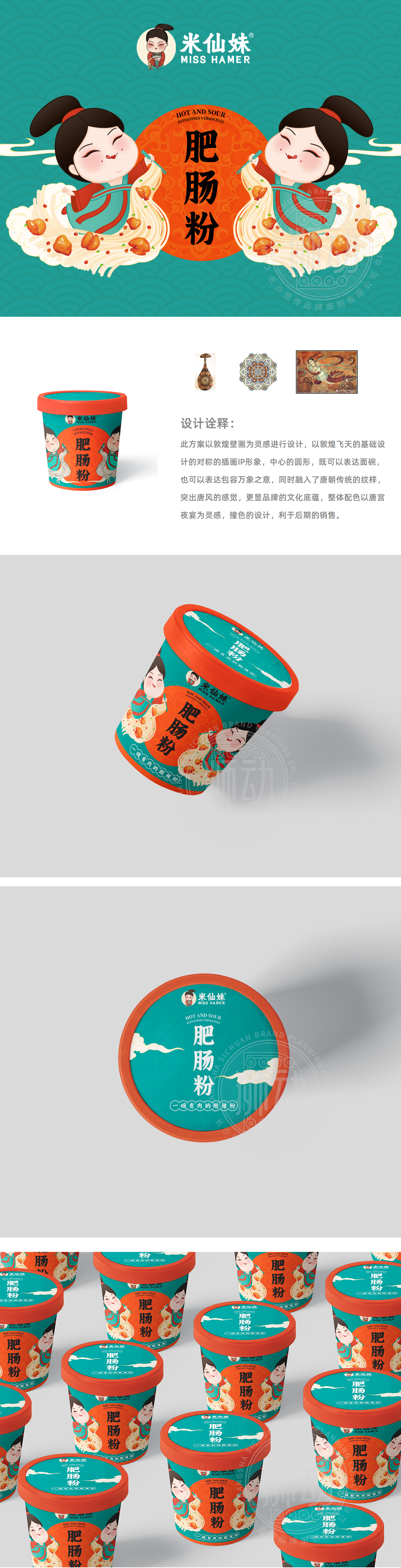
狮动设计以敦煌飞天为原型,提炼出两个对称排列的卡通人物形象——身着唐装、姿态灵动,既保留了壁画的飘逸感,又通过Q版设计降低了距离感。这种「传统符号+现代萌感」的组合,刚好契合快消品「亲切、易传播」的需求,能快速拉近与年轻消费者的距离。中心的圆形既是「碗」的具象化,又是「包容万象」的抽象寓意(呼应品牌传递的「多元、包容」调性)。这种「一语双关」的设计,让图形不仅是装饰,更成为品牌理念的传递者。整体通过简化处理,突显唐风的华贵感,纹样更像「文化密码」,悄悄传递着品牌的「底蕴感」,让肥肠粉包装有了「不一样的故事」。
Based on the flying sky in Dunhuang, the lion dance design extracts two symmetrically arranged cartoon characters-dressed in Tang costumes and smart posture, which not only retains the elegant feeling of murals, but also reduces the sense of distance through the Q version design. This combination of "traditional symbols+modern cute feeling" just meets the needs of FMCG "friendly and easy to spread" and can quickly narrow the distance with young consumers.The circle in the center is not only the concretization of the bowl, but also the abstract meaning of "inclusiveness" (echoing the tonality of "diversity and inclusiveness" conveyed by the brand).


扫码或拨打添加客服微信


