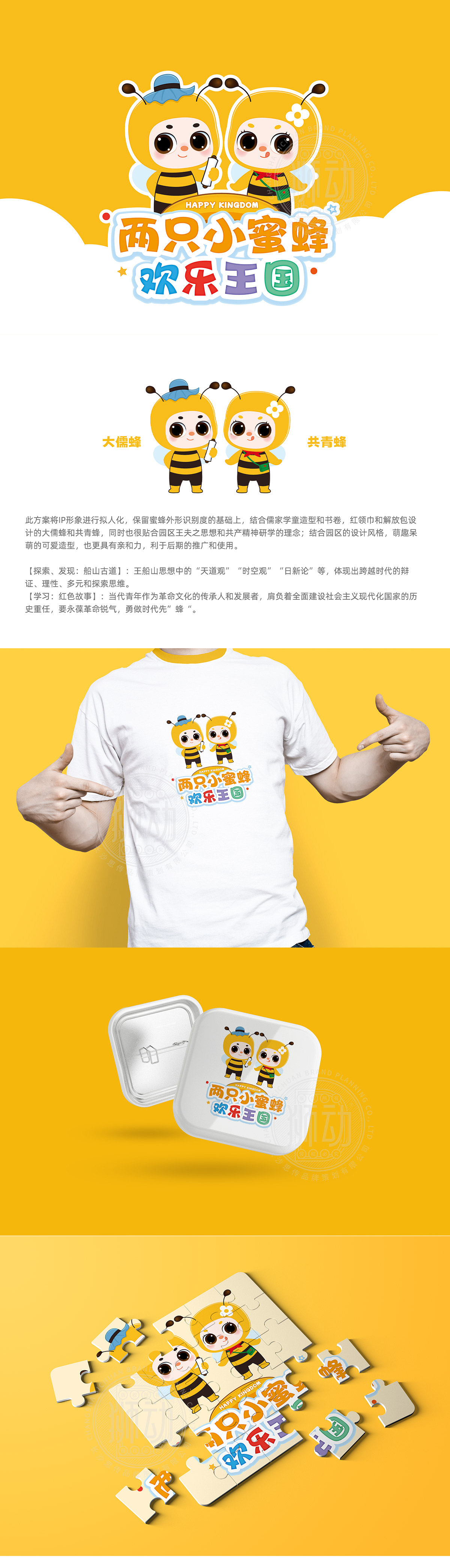
狮动设计用“元素密码”解码文化,用“萌趣造型”降低传播门槛,紧扣“蜜蜂”的强符号:两个IP均保留了蜜蜂的核心特征——黄黑相间的条纹躯干、圆钝的触角、透明的小翅膀,这一设计让IP从视觉上快速“破圈”,联想到“勤劳、团队”的特质,符合园区“研学”“奋进”的氛围。大儒蜂:以“儒家学童”为原型,蓝色的瓜皮帽、手中的书卷,直接关联“王夫之思想”中的“天道观”“时新论”,将抽象的哲学理念转化为可感知的视觉符号,让“研学”有了“具象的老师”;共青蜂:红领巾、绿色解放包、胸前的小花,这些“红色符号”精准对应“共产精神研学”的主题,将“革命传承”转化为“可爱的伙伴”,降低了红色文化的传播门槛。造型风格:萌趣化实现“全民友好”:拟人化的圆眼睛、红脸蛋、短腿造型,完全贴合“亲子研学”“家庭旅游”的场景需求——孩子会因为“可爱”主动亲近,家长则会因为“文化内涵”愿意传播,这种“老少皆宜”的设计,让IP成为园区的“视觉锚点”。
Lion design uses "element code" to decode culture, and uses "cute modeling" to lower the threshold of communication.Close to the strong symbol of "bee": Both IPs retain the core features of bees-yellow and black striped trunk, round and blunt tentacles and transparent little wings. This design makes IP break the circle quickly visually and associate it with the characteristics of "hard work and teamwork", which is in line with the atmosphere of "study" and "forge ahead" in the park. Great Confucian Bee: The blue melon hat and the scroll in his hand are based on the Confucian school children, which directly relate to the concept of heaven and the theory of modernity in Wang Fuzhi's thought, transforming abstract philosophical ideas into perceptual visual symbols and giving "research" a "concrete teacher".


扫码或拨打添加客服微信
