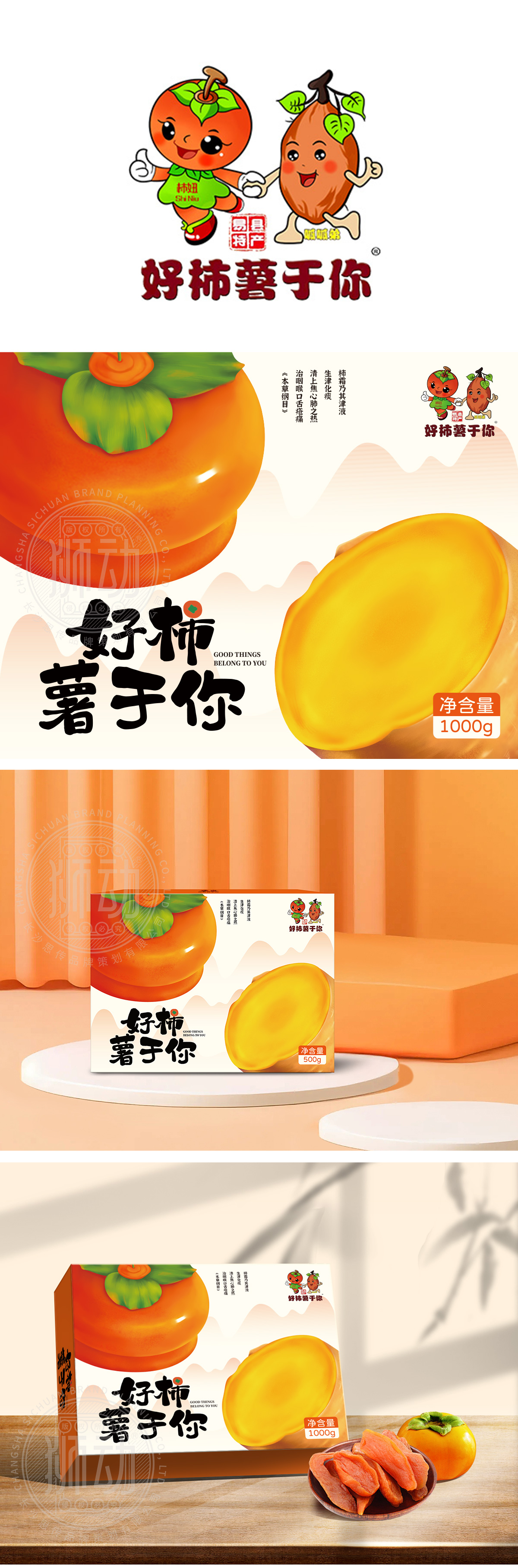
狮动设计采用“柿+薯”双核心图形**,柿子采用橙红→橘色的渐变,表面添加细微的光泽感(体现水果的新鲜度),红薯:采用“切开的切面”造型,内部填充饱和的明黄色(模拟红薯蒸熟后的软糯质感),边缘做了轻微的“流心”效果,仿佛刚出炉的热乎劲儿,瞬间激发食欲。主标题“好柿薯于你”采用毛笔字体,笔画粗细变化自然,“柿”(谐音“事”)、“薯”(谐音“属”)的谐音梗,用传统吉祥话的方式传递“美好祝福”(比如“好事属于你”),强化情感共鸣;整体设计采用“用户能看懂、能记住、能产生情感连接”的方式,实现了包装的核心目标——让产品“说话”,让消费者“心动”。
Lion design adopts double-core graphics of "Persimmon+Potato" * *, Persimmon: presented in a stacked way, with a gradual change from orange red to orange, with a slight gloss on the surface (reflecting the freshness of fruit), and sweet potato: shaped as a "cut section", filled with saturated bright yellow (simulating the soft waxy texture of sweet potato after steaming), with a slight "flowing heart" effect on the edge. The main title "Good Persimmon and Potato for You" uses a brush font, and the stroke thickness changes naturally. The homophonic stalks of "Persimmon" (homophonic "thing") and "potato" (homophonic "genus") convey "good wishes" (such as "good things belong to you") in a traditional auspicious way, which strengthens emotional resonance.


扫码或拨打添加客服微信


