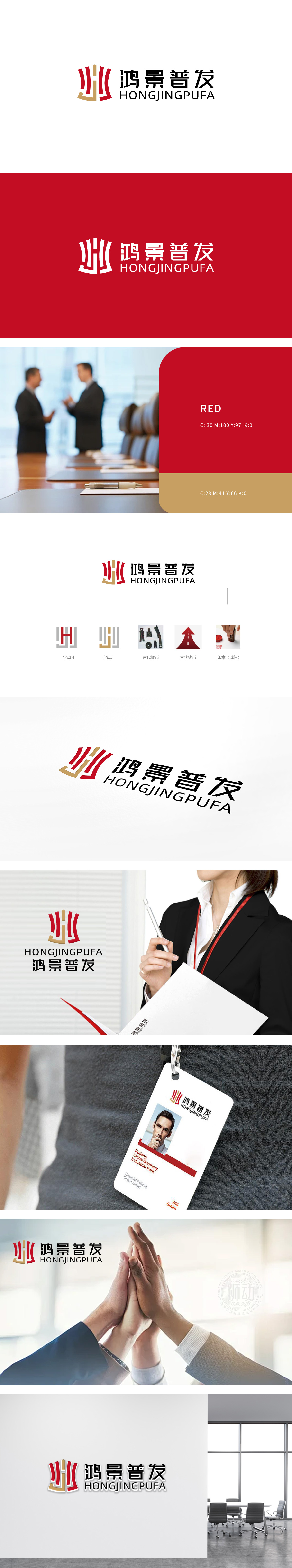
狮动设计以企业名称首字母**「H」(鸿)和「J」(景)为核心骨架,通过抽象化处理实现双重含义:两者叠加后形成类似古代钱币的轮廓,既保留了字母的识别性,又直接关联金融行业的“财富、流通”本质。通过“字母识别+行业符号+价值观传递”的三重逻辑,实现了“视觉记忆”与“商业诉求”的完美结合:图形整体采用红+金的配色:红色源自传统印章的印泥色,传递“权威、可信”;金色呼应古代钱币的金属质感,象征“价值、稳健”,双重色彩强化金融品牌的“靠谱感”。
Lion design takes the initials * * "H" (Hong) and "J" (Jing) of the enterprise name as the core skeleton, and realizes double meanings through abstraction: the two are superimposed to form an outline similar to ancient coins, which not only retains the recognition of letters, but also directly relates to the "wealth and circulation" essence of the financial industry. Through the triple logic of "letter recognition+industry symbol+value transmission", the perfect combination of "visual memory" and "business appeal" is realized: the whole figure adopts red+gold color scheme.


扫码或拨打添加客服微信


