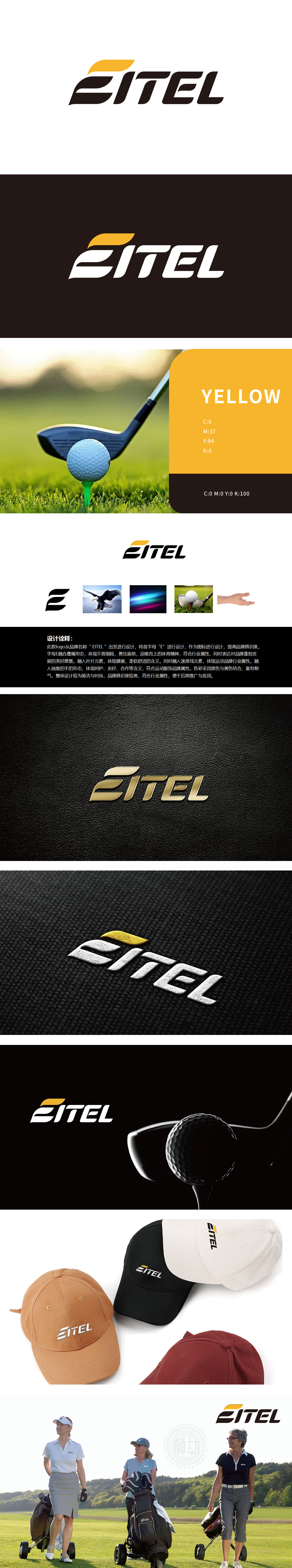
狮动设计以品牌名称“EITEL”的首字母“E”为核心设计载体,通过简化与重构,将“E”从单纯的字母转化为具有象征意义的图形符号。高尔夫运动的“视觉转译”,将运动的“精神”与“场景”转化为可感知的图形语言:将“E”的左侧竖线与横折重构为“鹰嘴”的轮廓——锋利、尖锐、象征对“每一杆都精准”的追求;“E”的右侧简化为“叶片”的形态——柔和、舒展、带有自然感。叶片的“柔软”“轻盈”传递运动装备的“舒适感”“透气性”,符合高尔夫爱好者对“高品质装备”的需求。整体设计将高尔夫运动的“精神内核”(精准、挑战、专业),通过“首字母变形”的方式转化为可感知的视觉符号,又实现了与高尔夫爱好者的“情感共鸣”。
Lion Design takes the initial letter "E" of brand name "EITEL" as the core design carrier, and through simplification and reconstruction, the "E" is transformed from a simple letter into a symbolic graphic symbol. The "visual translation" of golf transforms the "spirit" and "scene" of the sport into a sensible graphic language: reconstructing the left vertical line and horizontal fold of "E" into the outline of "Eagle's Mouth"-sharp and sharp, symbolizing the pursuit of "every shot is accurate"; The right side of the "e" is simplified to the shape of a "leaf"-soft, stretched and natural. The "softness" and "lightness" of the blades convey the "comfort" and "breathability" of sports equipment, which meets the needs of golf enthusiasts for "high-quality equipment".


扫码或拨打添加客服微信


