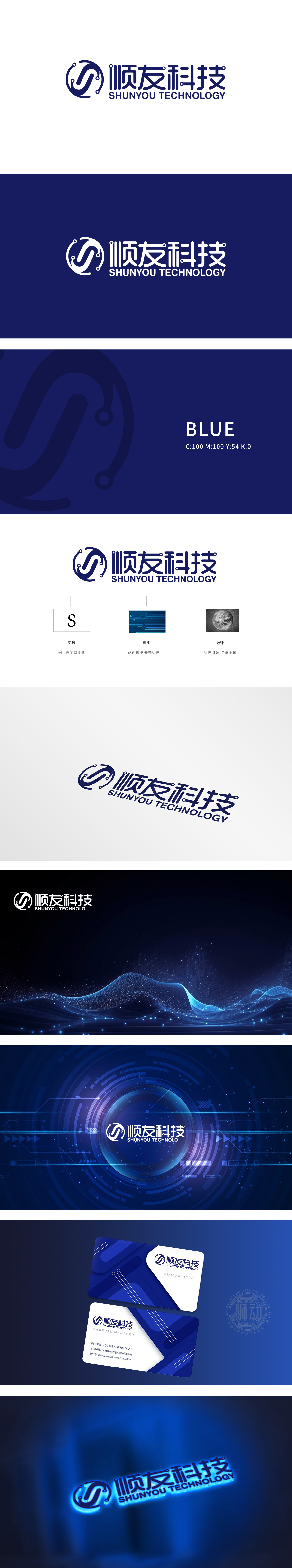
狮动设计以“顺友”首字母“S”为基底,用流动的曲线+点状节点变形,既保留了品牌的核心辨识度,又通过“漩涡”“电流”般的形态,将品牌名含义具象化,同时暗合IT行业“连接”“流动”,渐变的蓝调完美契合IT行业的“科技感”与“未来感”,电路+地球:下方的两个辅助图形堪称“神来之笔”:电路图案直接关联“IT技术”,用线条的延伸感隐喻“技术迭代”与“无限可能”;用视觉语言“说”出行业属性,每一个元素都在用视觉讲品牌故事,快速传达顺友科技是一家‘顺畅连接、科技驱动、全球布局’的IT公司”。
Lion Design is based on the inITials "S" of Shunyou, and it is deformed by flowing curves and point nodes, which not only retains the core recognition of the brand, but also visualizes the meaning of the brand name through the whirlpool and current-like form, and at the same time coincides with the "connection" and "flow" of the IT industry. The gradual blues perfectly fit the "sense of technology" and "sense of the future" of the IT industry. Use visual language to "tell" the industry attributes, and every element is telling the brand story visually.


扫码或拨打添加客服微信


