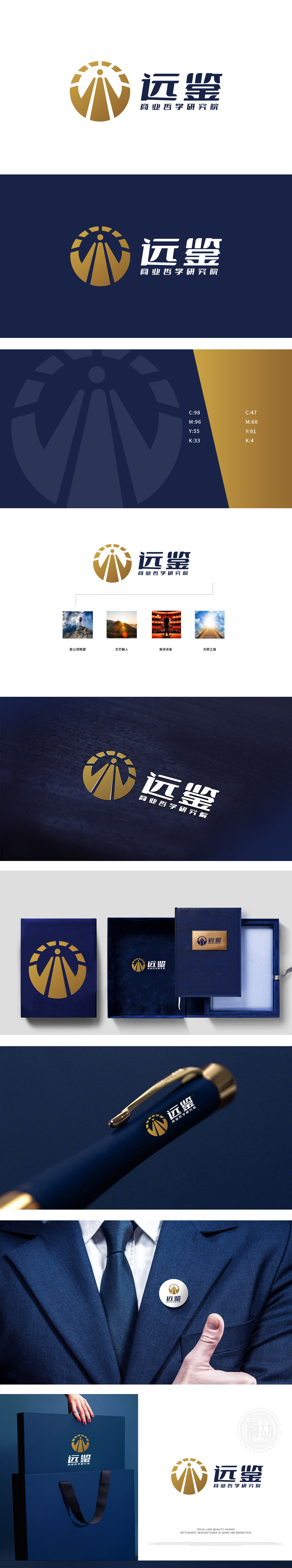
狮动设计以「圆形+放射状线条+中心人形」为核心元素,配色采用金色(主视觉)+深蓝色(辅助),每一处细节都在强化「商业哲学研究院」的定位:圆形轮廓:象征「完整」「永恒」,符合研究院「长期主义」「系统思考」的商业哲学;放射状线条:既像「太阳光芒」(代表智慧、启蒙),又像「向四周延伸的道路/阶梯」(代表探索、传播),结合中心「站立的人形」(简化为抽象的「人」字),共同传递「站在认知的高处,用智慧指引方向」的「远鉴」内涵——人是核心,视野是关键,智慧是光芒;「视觉-文字」配对**的方式,将研究院的「核心活动/价值」转化为可感知的画面,与LOGO形成「理念-落地」的呼应:既保持了学术机构的严谨,又用鲜活的符号降低了理解门槛,完美契合「商业哲学研究院」的定位。
Lion design takes "circle+radial line+central human figure" as the core element, and the color scheme adopts gold (main vision)+dark blue (auxiliary). Every detail strengthens the positioning of the Business Philosophy Research Institute: the circular outline symbolizes "integrity" and "eternity", which conforms to the business philosophy of the Institute's "long-term" and "systematic thinking"; Radial lines: both like "the sun's rays" (representing wisdom and enlightenment) and like "the road/ladder extending around" (representing exploration and communication), combined with the central "standing humanoid" (simplified as the abstract word "human"), jointly convey the "foresight" connotation of "standing on the high ground of cognition and guiding the direction with wisdom"-human is human.


扫码或拨打添加客服微信


