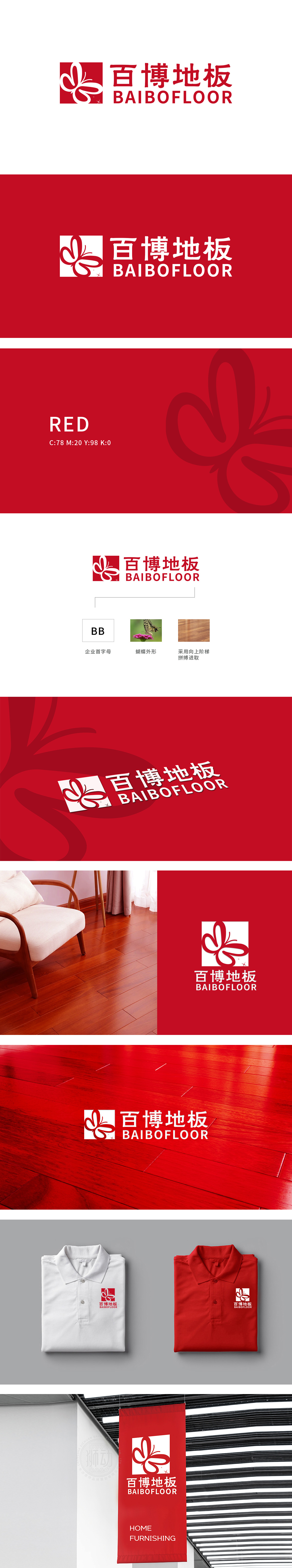
狮动设计用符号讲品牌故事,红色方形基底:方形=“稳定”:地板是“铺在脚下的基础”,方形的扎实感刚好对应“地板要稳、要耐用”的产品属性,让消费者看到LOGO就联想到“百博地板能给家一个稳固的支撑”;蝴蝶=“自然”:地板的核心原料是木材,蝴蝶作为“自然的精灵”,能瞬间唤醒消费者对“天然、环保、质感”的联想,同时“蝴蝶破茧”的意象又暗合“百博”的“成长”寓意;整体设计将“企业首字母”与“自然符号”做了创意融合,行业辨识度高,又传递“拼搏进取”的企业精神。
Lion design uses symbols to tell the brand story. The red square base: square = "stability": the floor is "the foundation laid under the feet", and the solid feeling of the square just corresponds to the product attribute of "the floor should be stable and durable", which makes consumers think that "Baibo floor can give a stable support to their homes" when they see the LOGO. Butterfly = "Nature": the core raw material of the floor is wood. As a "natural spirit", butterfly can instantly awaken consumers' association with "nature, environmental protection and texture".


扫码或拨打添加客服微信


