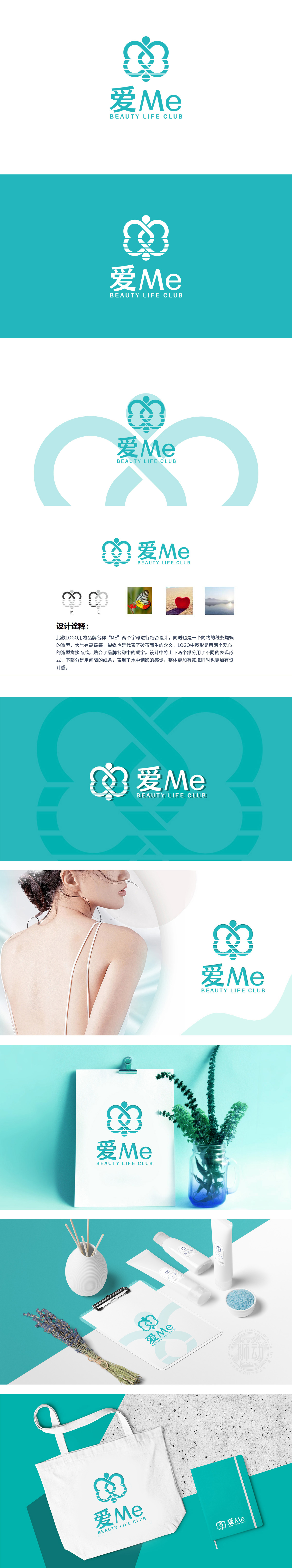
狮动设计以“蝴蝶翅膀+人形+丝带”的组合:蝴蝶翅膀:左右对称的弧形结构,像展开的蝴蝶翅膀,从蛹到蝶的过程,对应“美容=改变与新生”。缠绕的线条:像飘动的丝带,又像连接翅膀的“纽带”。丝带的柔软感传递“温柔美容”的理念,同时“缠绕”的形态象征美与生活的连接,极简的“头+躯干”符号,用一个小圆圈+竖线表示,直接指向“用户”——所有美容服务的核心都是“人”,突出“以客户为中心”的品牌立场。爱Me”的中文名称+“Me”的英文强调,直接传递**“美容是自我关怀”**的价值观——不是为了讨好别人,而是“爱自己,所以让自己更美丽。
Lion design is a combination of "butterfly wings+human figure+ribbon": butterfly wings: symmetrical arc structure, like unfolded butterfly wings, the process from pupa to butterfly corresponds to "beauty = change and rebirth". Twisted lines: like fluttering ribbons, but also like "ties" connecting wings. The softness of the ribbon conveys the concept of "gentle beauty", while the winding shape symbolizes the connection between beauty and life. The minimalist symbol of "head+trunk" is represented by a small circle+vertical line, which directly points to the "user"-the core of all beauty services is "people", highlighting the brand position of "customer-centered". The Chinese name of "Love Me"+the English name of "Me" emphasizes that it directly conveys the values of * * "Beauty is self-care"-not to please others, but to "love yourself, so make yourself more beautiful.


扫码或拨打添加客服微信


