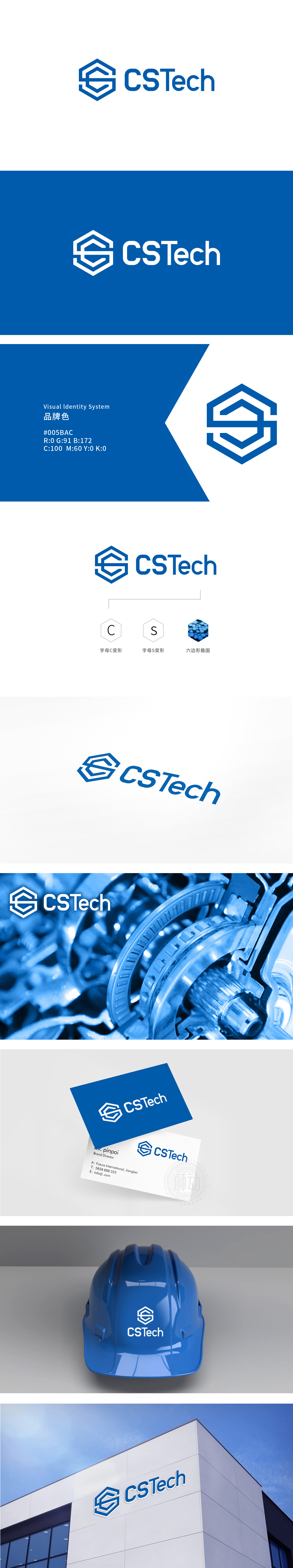
狮动设计以六边形为核心轮廓,六边形在工业中是“稳固性”与“高效性”的象征,直接传递品牌“可靠、扎实”的工业属性;六边形作为C、S字母的“容器”,将两个字母统一在同一视觉体系中,形成“整体感”,仿佛隐喻品牌在工业领域的“整合能力”。主色调采用“工业蓝”,传递“专业、科技、可靠”的工业属性,瞬间将品牌与“工业科技”划上等号;每一个元素都不是“艺术创作”,而是“工业力量的视觉翻译”。
Lion design takes hexagon as the core outline, which is a symbol of "stability" and "efficiency" in industry and directly conveys the industrial attributes of the brand "reliability and solidity"; Hexagons, as containers of C and S letters, unify the two letters in the same visual system, forming a "sense of wholeness", which seems to be a metaphor for the brand's "integration ability" in the industrial field.


扫码或拨打添加客服微信


