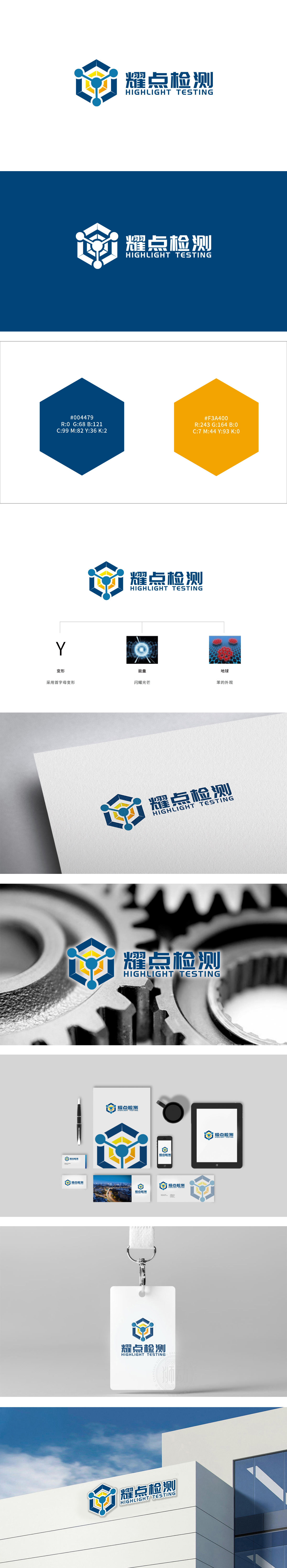
狮动设计以字母变形(Y)既保留了品牌名称的识别性,也通过“几何变形”强化了“工业设计”的质感,暗示品牌在图形分析中的“形态识别”能力,中间的“能量”图标是一个闪耀的光轮,视觉上充满“爆发力”与“精准性”,隐喻检测技术的“高能量”,同时呼应主LOGO中的“能量核心”元素,形成视觉统一。耀”强调“聚焦、突出”;“点”则隐含“精准、细微”,二者结合直接传递“精准定位问题”的行业价值。耀点检测”的品牌视觉体系通过符号化拆解与语义关联,将“检测”的核心属性与“科技感”“精准性”“行业特质”深度融合,每一处细节都在传递“聚焦本质、科技赋能”的品牌理念。
Lion design not only retains the recognition of brand name with letter deformation (Y), but also strengthens the texture of "industrial design" through geometric deformation, suggesting the brand's ability of shape recognition in graphic analysis. The "energy" icon in the middle is a shining light wheel, which is visually full of "explosiveness" and "accuracy", implying the "high energy" of detection technology and echoing the LOGO. Yao "emphasizes" focusing and highlighting "; "Point" implies "precision and subtlety", and the combination of the two directly conveys the industrial value of "accurate positioning problem".


扫码或拨打添加客服微信


