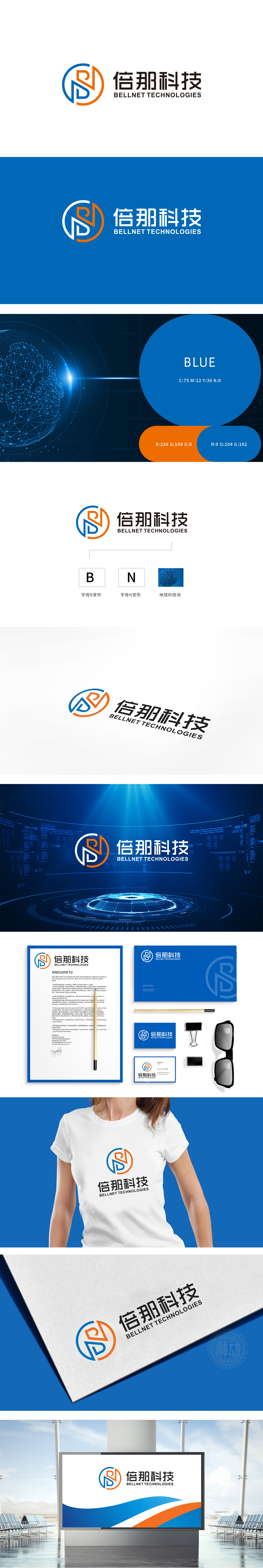
狮动设计采用「B+N」的组合变形,字母「B」的极简变形,线条硬朗且有「延伸感」,像科技产品的轮廓,传递「专业、可靠」的科技属性;字母「N」,线条更圆润,像展开的翅膀或箭头,传递「创新、活力」的企业精神;圆形外框:将B和N包裹其中,既象征「全球化」,也暗示「闭环、整合」.「用极简语言讲清楚品牌内核」,每一处细节都在强化「科技感」与「全球化」的核心定位。
Lion design is a combination deformation of "B+N", a minimalist deformation of the letter "B", with tough lines and a sense of "extension", like the outline of scientific and technological products, conveying the scientific and technological attributes of "professionalism and reliability"; The letter "n" is more rounded, like spreading wings or arrows, conveying the entrepreneurial spirit of "innovation and vitality"; Circular outer frame: wrapping B and N in it not only symbolizes "globalization", but also implies "closed loop and integration".


扫码或拨打添加客服微信


