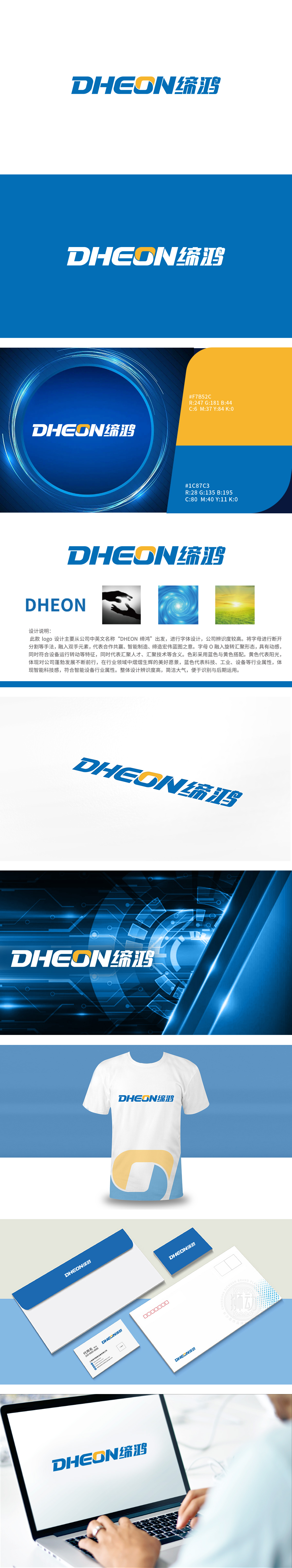
狮动设计以“DHEON缔鸿”中英文名称为核心,通过字体重构+意象融入的手法,将抽象理念转化为可感知的图形:字体设计:断裂与融合的平衡:字母“DHEON”采用“断开分割”的处理,将“双手交握”的意象与字体结构结合——这种设计不仅提升了LOGO的辨识度,更将“合作共赢”、“智能制造”、“缔造宏伟蓝图”等品牌理念具象化,实现了“形”与“意”的高度统一。“汇聚”的形态象征“人才、技术、资源的聚集”,将“企业战略”转化为可感知的图形符号。整体设计将“合作共赢、智能制造、缔造蓝图”的理念转化为图形,实现了“品牌理念-视觉符号-行业认知”的闭环。
Lion Design takes the Chinese and English names of "DHEON Dihong" as the core, and transforms abstract ideas into perceptible figures through font reconstruction+image integration: font design: the balance between fracture and integration; the letter "DHEON" is treated as "broken segmentation", and the image of "hands clasping" is combined with font structure-this design not only improves the recognition of LOGO, but also will "win-win cooperation" The form of "convergence" symbolizes "the gathering of talents, technology and resources" and transforms "enterprise strategy" into a perceptible graphic symbol.


扫码或拨打添加客服微信


