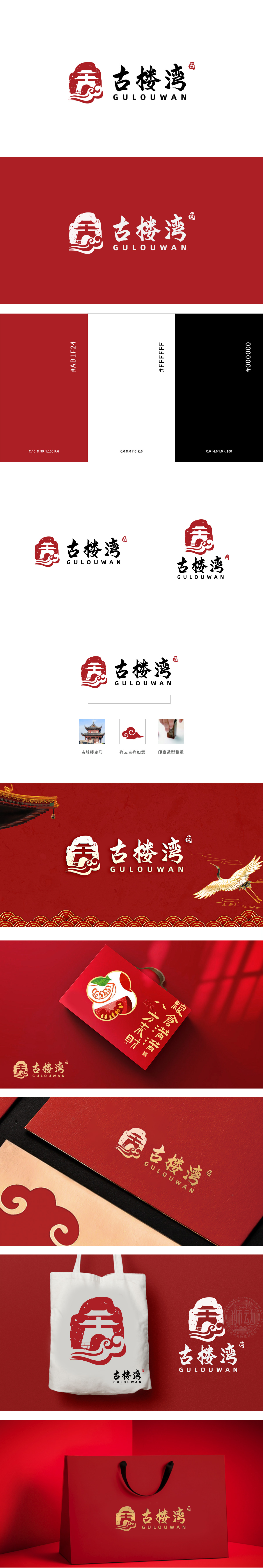
狮动设计采用传统牌楼的经典形态,明确传递“地域化”标签,让消费者快速建立“地道、本土”的认知;波浪:用简洁的曲线模拟“水流”形态,既呼应“湾”的地理属性,更隐含“新鲜、流动”的特质,融入印章元素,印章在传统文化中象征“权威、可靠、有传承”,对应品牌最需要传递的“安全可信赖”属性,红底是传递“喜庆、热闹”,整体以“传统符号+地域属性”为核心框架,用简洁的视觉语言传递“地域化、信任感、新鲜度”。
Lion design adopts the classic form of traditional archway, clearly conveys the label of "localization", and allows consumers to quickly establish "authentic and local" cognition; Waves: simulating the shape of "water flow" with simple curves not only echoes the geographical attributes of "Bay", but also implies the freshness characteristics of "freshness and fluidity", and incorporates the seal element. The seal symbolizes "authority, reliability and inheritance" in traditional culture, corresponding to the "safety and trustworthiness" attribute that fresh brands need to convey most, and the red background conveys "jubilation and excitement".


扫码或拨打添加客服微信


