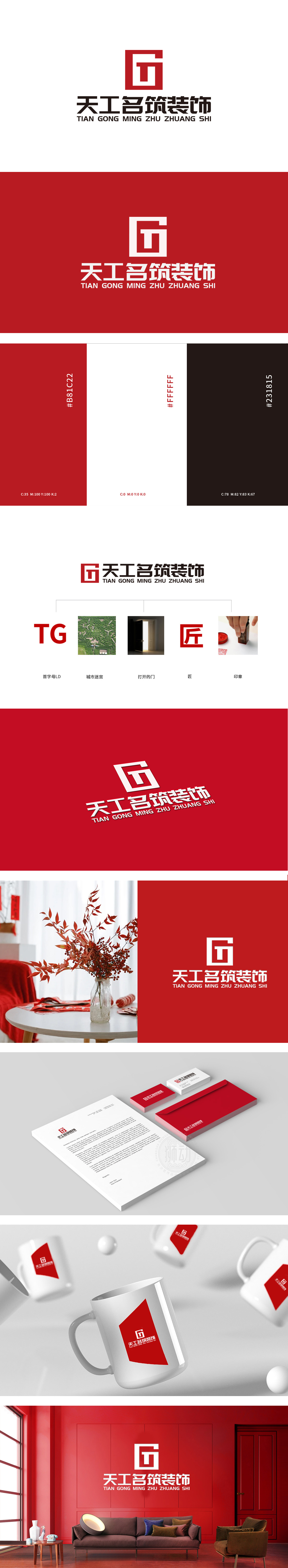
狮动设计以TG”首字母,用高饱和度的红色+粗体设计,视觉冲击力极强,像一把“钥匙”直接打开品牌认知的大门;迷宫线条隐喻空间规划的“诗”,传递“设计是空间的二次生命”的理念。整体用符号化语言构建了一个“有故事、有温度、有专业度”的家居装饰品牌形象 ,每一个元素都在说:“我们是懂空间、懂生活、懂工艺的装饰公司”。
Lion design starts with TG, and is designed with high saturation red+bold, which has a strong visual impact, like a "key" to directly open the door to brand recognition; Labyrinth lines are metaphors of "poetry" in space planning, and convey the idea that "design is the second life of space". As a whole, a brand image of home decoration with story, temperature and professionalism is constructed with symbolic language, and every element is saying.


扫码或拨打添加客服微信


