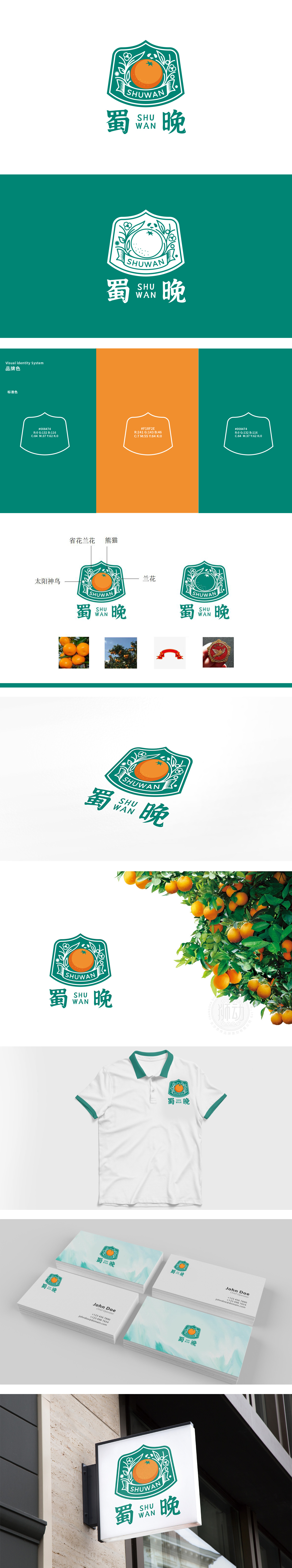
狮动设计将品牌的“地域基因”“产品属性”与“文化内涵”浓缩为可感知的图形语言:核心符号:果实(生鲜的“视觉锚点”),以橙色饱满果实为视觉中心,橙色是生鲜产品中最能激发“食欲感”与“成熟度”的颜色,直接传递“新鲜、香甜、可食用”的产品属性;绿色果实,对应“生态种植”“早期采摘”或“不同品种”的产品系列,果实的“圆形”轮廓与“盾牌型外框”结合,既模拟了“果实的天然形态”,又借盾牌的“可靠感”强化了“生鲜产品的品质信任”——这一设计巧妙解决了“生鲜品牌需要的亲和力”与“品质感”的矛盾。整体用图形搭建了“文化+生鲜”的品牌语言,每一处细节都透露出对品牌定位的精准拿捏与设计巧思。
Lion Design condenses the brand's regional genes, product attributes and cultural connotations into a sensible graphic language: the core symbol: fruit (fresh "visual anchor"), with orange full fruit as the visual center, and orange is the color that can stimulate appetite and maturity in fresh products, directly conveying the product attributes of "fresh, sweet and edible"; Green fruit corresponds to the product series of "ecological planting", "early picking" or "different varieties". The combination of the "round" outline of the fruit and the "shield-shaped frame" not only simulates the "natural shape of the fruit".but also strengthens the "quality trust of fresh products" .


扫码或拨打添加客服微信


