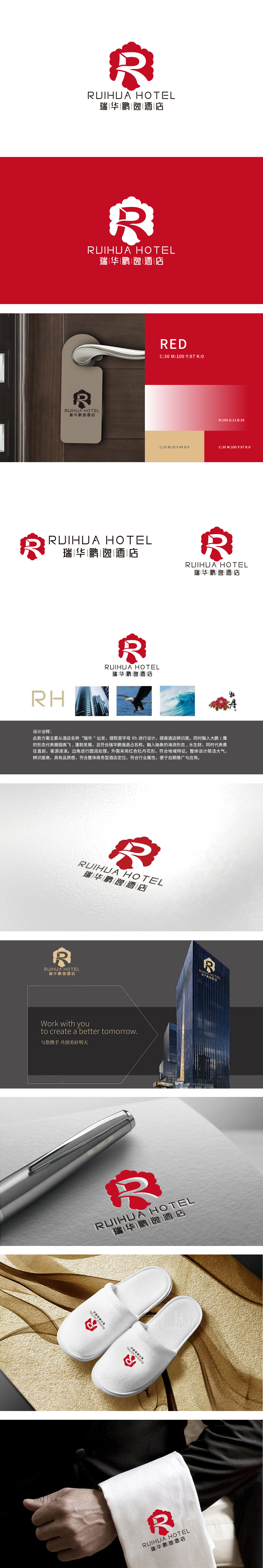
狮动设计以首字母“RH”为核心,通过艺术化变形形成视觉主符号:“R”采用流畅的曲线设计,又模拟了“大鹏展翅”的动感(呼应“鹏逸”二字);“H”则以简洁的直线构成,暗示“便捷、高效、现代”的服务特质。外框采用红色牡丹花形,一方面紧扣“地域特征”,另一方面红色本身具有强烈的视觉冲击性,提升品牌辨识度;整体设计通过“牡丹”“大鹏”“海浪”等中国传统意象,将“东方智慧”与“商务需求”的完美共生。
Lion design takes the initial letter "RH" as the core, and forms the visual main symbol through artistic deformation;"R" adopts a smooth curve design, which also simulates the movement of "Dapeng spreading its wings" (echoing the word "Pengyi"); "H" is composed of simple straight lines, implying the service characteristics of "convenience, efficiency and modernity". The outer frame is in the shape of red peony, which on the one hand closely follows the "regional characteristics", on the other hands.


扫码或拨打添加客服微信


