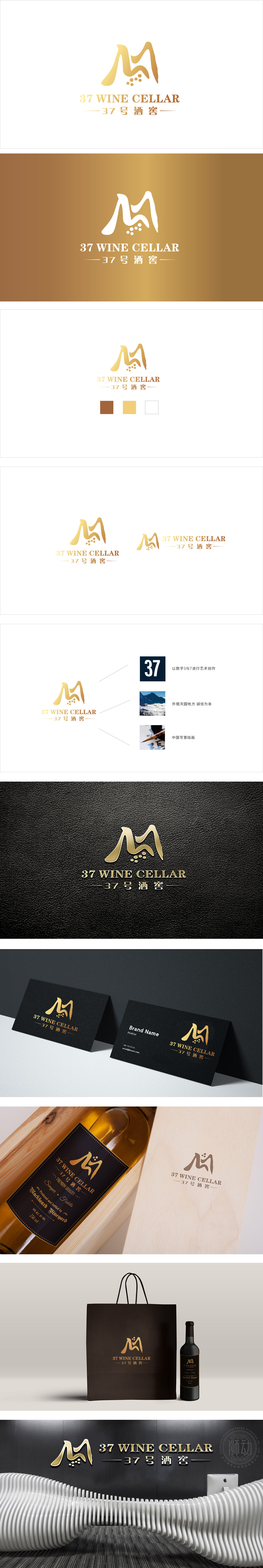
狮动设计采用流畅的曲线M勾勒,既像酒窖的“窖”字意象,又隐含“酒”(Wine)的首字母联想,同时曲线的起伏感模拟了“酒液流动”的动态,符合酒类品牌的鲜活感;5个点状元素是点睛之笔:既可以理解为“葡萄颗粒”,也可以看作“酒滴”,甚至暗示“37”中的“7”,用极简符号串联起“原料-产品-品牌编号”的逻辑链,LOGO采用暖金色渐变,这种色调自带奢华、经典、沉淀的属性,完美匹配“酒窖”的高端储存、年份质感定位;“37号酒窖”采用书法体改良的衬线字体,笔画粗细有致,既有传统酒文化的“底蕴感”,又通过简化的笔画适应了现代视觉审美,中英文的搭配平衡了“本土品牌”与“国际视野”的需求。
Lion design is outlined by a smooth curve M, which is not only like the image of "cellar" in a Wine cellar, but also implies the first letter association of "wine". At the same time, the undulating feeling of the curve simulates the dynamic of "wine flow", which accords with the fresh feeling of wine brands. The five dot elements are the crowning touch: they can be understood as "grape grains", or as "wine drops", and even imply "7" in "37". The logical chain of "raw materials-products-brand numbers" is connected in series with minimalist symbols, and the LOGO adopts a warm gold gradient. This color tone has its own luxury, classic and precipitation attributes.


扫码或拨打添加客服微信


