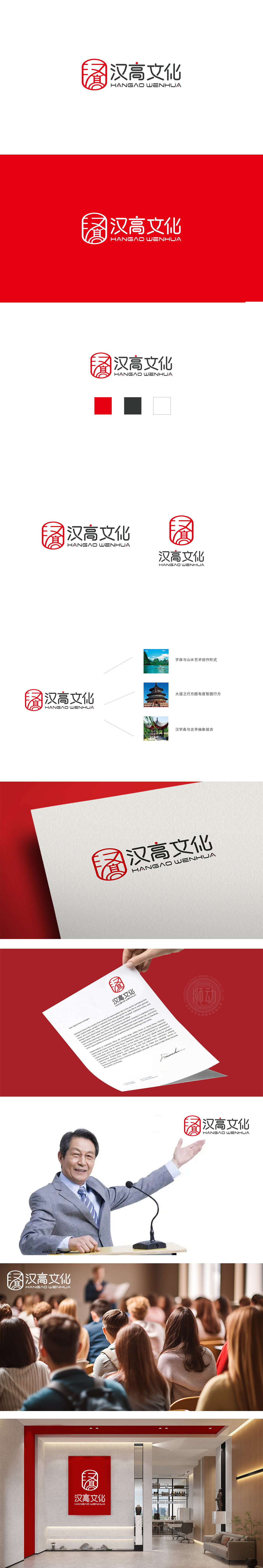
狮动设计以“汉”字为核心,用书法笔触拆解重构,融合了传统建筑元素与文化符号。将“汉文化”的厚重感转化为可视觉化的符号:红色象征着传统文化的热情与活力,印章形态传递着“信用、权威”,“汉”字的变形则直接点出了品牌的文化内核——以汉文化为根基,这与文化传媒公司“传承文化、传播价值”的核心使命高度一致。高起点(传承汉文化的高规格)、高活力(现代传播的灵动性)、高辨识度(视觉上的记忆点)。整个logo既有“文化的厚重”,又有“传播的温度”,符合文化传媒公司“连接文化与受众”的角色定位。
Lion design takes "Chinese" as the core, which is disassembled and reconstructed by calligraphy strokes, and integrates traditional architectural elements and cultural symbols. Transform the heavy feeling of "Chinese culture" into a visual symbol: red symbolizes the enthusiasm and vitality of traditional culture, the seal shape conveys "credit and authority", and the deformation of the word "Han" directly points out the cultural core of the brand-based on Chinese culture, which is highly consistent with the core mission of cultural media companies to "inherit culture and spread value".


扫码或拨打添加客服微信


