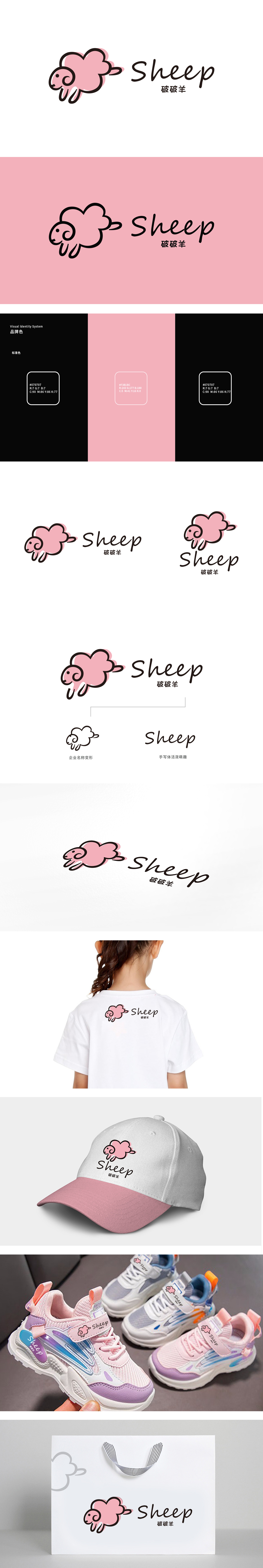
狮动设计用“绵羊”建立强情感联结,直接戳中儿童审美,logo的主体是一只卡通化的绵羊,线条做了极致的“圆润化处理”:这种“无棱角”的造型,刚好符合儿童对“安全、可爱”的感知习惯,更妙的是,绵羊的“毛茸茸”质感,直接关联了儿童服装/鞋类的核心属性:柔软、舒适、温暖。 颜色搭配:主色用了低饱和度的粉,既保留了儿童喜欢的“活泼感”,再加上黑边的勾勒既强化了形象的“辨识度”,整体用绵羊的“软”关联服装的“舒适”;用粉色的“柔”传递产品的“安全”;用圆润的“形”满足孩子的“亲近感”;用简洁的“字”照顾家长的“实用性”。平衡了“童趣”与“功能性”。
Lion esign uses "sheep" to establish a strong emotional connection, which directly pokes children's aesthetics. The main body of logo is a cartoon sheep, and the lines are rounded to the extreme: this "angular-free" shape just conforms to children's perception habit of "safety and cuteness", and even better, the "furry" texture of sheep directly relates to the core attributes of children's clothing/footwear: Color matching: the main color uses low saturation powder, which not only retains the "liveliness" that children like, but also enhances the "recognition" of the image with the outline of the black border, which makes the overall use of the "soft" clothing of sheep "comfortable"; Use pink "softness" to convey the "safety" of products.


扫码或拨打添加客服微信


