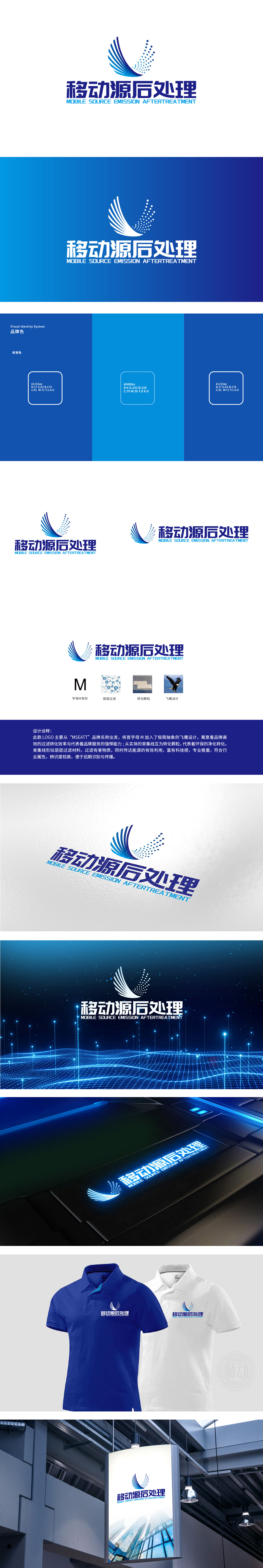
狮动设计用“M+飞鹰”的极简抽象设计,将品牌首字母“M”拆解重构竖线延伸为飞鹰的“躯干”,线转化为“翅膀”,同时用放射状束集线,模拟翅膀的动态,既保留了“M”的辨识度,又赋予其“飞鹰”的具象联想。飞鹰的“迅捷”象征“高效的过滤转化效率”,整体将品牌基因融入核心符号,实现“视觉-品牌”的强绑定;懂行业:将“过滤、转化”等核心技术转化为可感知的视觉符号,让行业属性“一目了然”;懂传播:用极简造型、明确符号、统一色调,确保LOGO“好记、好认、好传”。
Lion Design uses the minimalist design of "M+ Flying Eagle", which extends the vertical line of the brand initials "M" into the "trunk" of the flying eagle, and transforms the line into "wings". At the same time, it uses radial bunches to simulate the dynamics of the wings, which not only retains the recognition of "M" but also gives it the concrete association of "Flying Eagle". The "swiftness" of feiying symbolizes "efficient filtration and transformation efficiency", and integrates brand genes into the core symbols as a whole to realize the strong binding of "vision-brand"; Understand the industry: transform the core technologies such as "filtering and transformation" into perceptible visual symbols.


扫码或拨打添加客服微信


