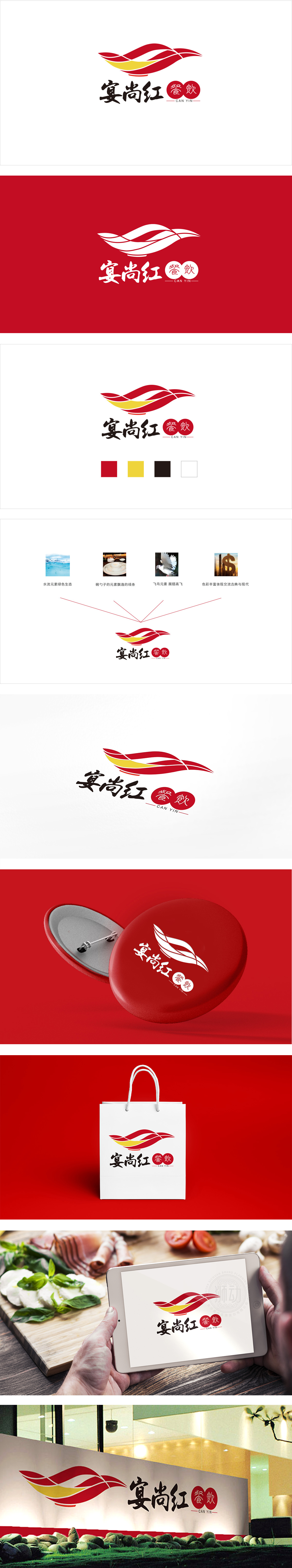
狮动设计用“流动感”讲透“宴”的氛围,像展开的丝带,又像扬起的酒旗,甚至带点“宴席上挥舞的红绸”的联想——流动的线条天然带有“庆祝、热闹”的情绪,完美契合“宴”的场景;红+黄的组合是中国传统喜庆色的“黄金搭档”——红色象征吉祥、热情,黄色代表富贵、温馨,两者叠加既醒目又不刺眼,瞬间能唤醒人们对“热闹宴席”的记忆;线条的穿插和渐变处理,让图形有了“立体层次感”,通过“符号化的视觉语言”,把“宴尚红”想表达的“喜庆、传统、有活力”的品牌性格,用最直观的方式传递给了用户。
Lion design expresses the atmosphere of the banquet with "fluidity", like unfurled ribbons, raised wine flags, and even a little association with "red silk waving at the banquet"-the flowing lines naturally have the emotion of "celebration and excitement", which perfectly fits the scene of the banquet; The combination of red and yellow is the "golden partner" of China's traditional festive colors-red symbolizes auspiciousness and enthusiasm, and yellow represents wealth and warmth. The superposition of the two is both eye-catching and not dazzling, which can instantly awaken people's memories of the "lively banquet".


扫码或拨打添加客服微信


