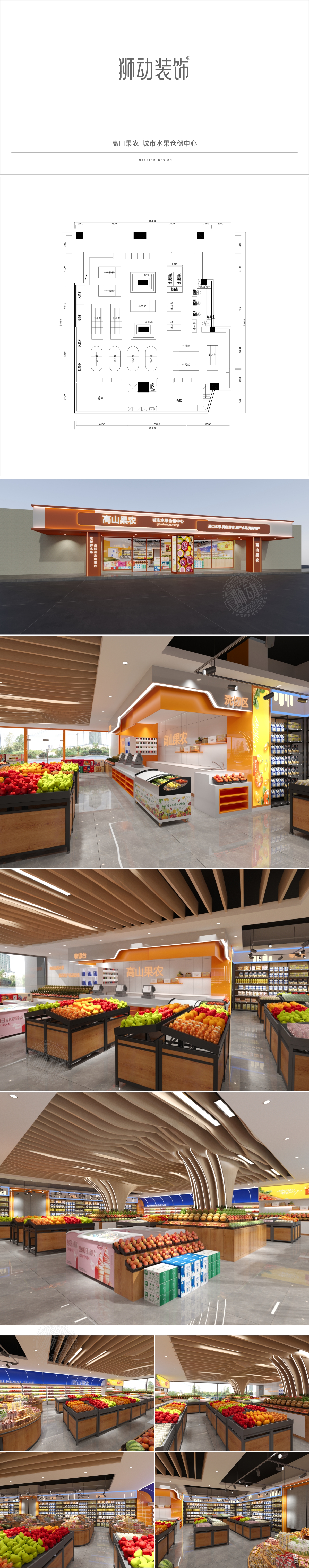
狮动设计用色彩与材质构建“产地直供”的信任感,通过色彩体系锚定品牌性格,主色用橙色(收银台背景、品牌标识):模拟水果的成熟感(如橘子、苹果),传递“新鲜、活力”的情绪,辅助色用木色:浅棕色木纹材质自带“自然、乡土”属性,呼应“高山果农”的“产地直供”定位,让顾客联想到果园的原生感;整体色彩搭配既保留了农产品的“原生感”,又不失现代零售的“精致感”,完美平衡了“高山果农”的“乡土品牌”与“都市水果店”的消费场景。从品牌调性、空间逻辑、视觉营销、功能细节四大维度拆解其设计智慧,每一处都紧扣“新鲜、自然、便捷”的核心,同时强化“高山果农”的品牌记忆点。
Lion design uses colors and materials to build the trust of "direct supply of origin", and anchors the brand character through the color system. The main color is orange (cashier background and brand logo), which simulates the ripe feeling of fruits (such as oranges and apples) and conveys the feeling of "freshness and vitality". The auxiliary color is wood color: light brown wood grain material has its own "natural and local" attributes, echoing "mountain fruit farmers". The overall color matching not only retains the "original feeling" of agricultural products, but also loses the "exquisite feeling" of modern retail, which perfectly balances the consumption scenes of "local brands" of "mountain fruit farmers" and "urban fruit shops".


扫码或拨打添加客服微信
