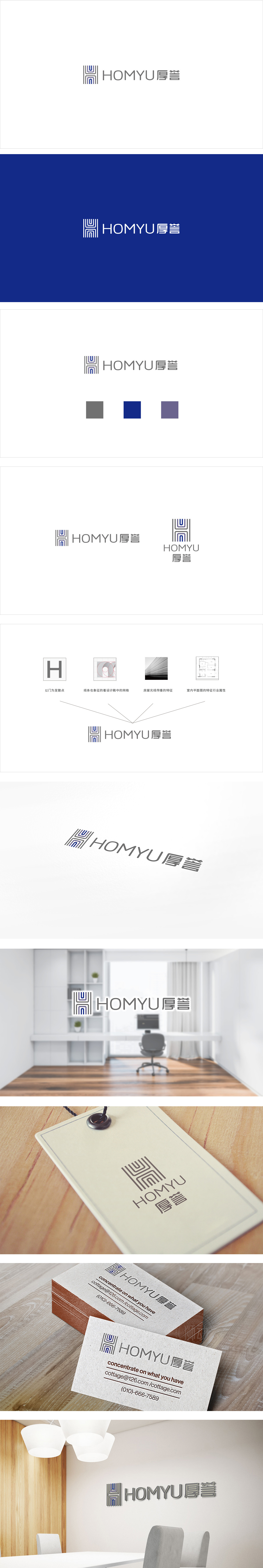
狮动设计以重叠的矩形线条+蓝色块构成,视觉上像“房屋的框架”,又似“家的层次感”(空间的递进感),直接关联家装的“空间构建”核心;蓝色块的点缀则带来稳定、舒适、可靠的心理感受,符合家庭环境的需求。文字与图形的协同:英文“HOMYU”显然是“HOME”(家)的变体,强化“家”的核心;中文“厚誉”则传递品牌的“口碑与信任”,与图形的“可靠感”形成呼应,符合家装行业“重信任、重体验”的消费特点。极简风格的适配,采用浅灰+蓝的低饱和度配色,符合当下家装“极简、北欧、现代”的主流审美,用视觉语言精准传递“家”的温度与品牌的可信度。
Lion design is composed of overlapping rectangular lines and blue blocks, which is visually like "the frame of the house" and "the sense of hierarchy of the home" (the progressive sense of space), and is directly related to the core of "space construction" of home decoration; The embellishment of blue blocks brings stable, comfortable and reliable psychological feelings, which meets the needs of family environment. The cooperation between words and graphics: English "HOMYU" is obviously a variant of "HOME", which strengthens the core of "home"; Chinese "good reputation" conveys the brand's "reputation and trust", which echoes the "reliability" of graphics and conforms to the consumption characteristics of "emphasizing trust and experience" in the home improvement industry.


扫码或拨打添加客服微信


