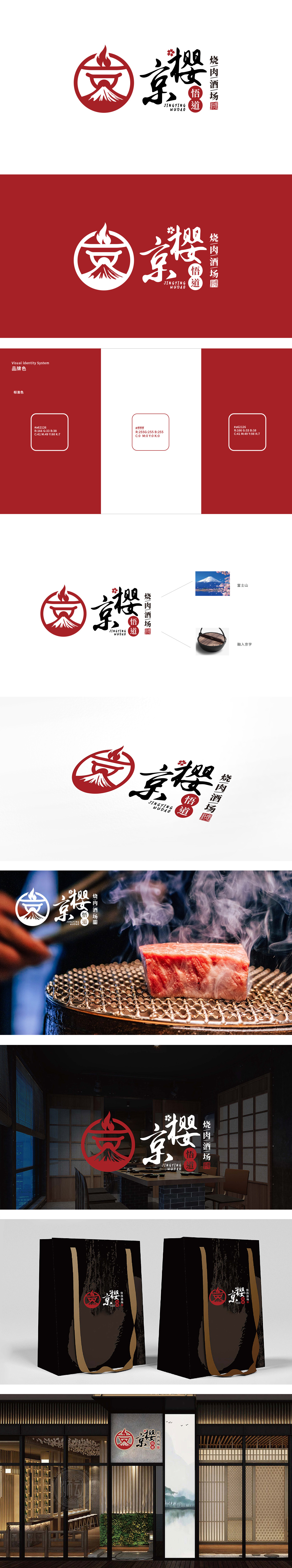
狮动设计用最简化的符号讲清了“烧肉酒场”的本质:顶部的火焰:直接对应“烧肉”的核心动作(火烤),曲线形态模拟火焰的跃动,传递“热乎、鲜活”的食欲感;底部的富士山:用白色放射状线条模拟火山的积雪与轮廓,瞬间将“日式”地域属性拉满——富士山是日本的“精神符号”,自带“正宗、地道”的信任感。 这三个元素叠加,即使不看文字,也能立刻联想到“日式烧肉”,图形的“可读性”极强,符合餐饮品牌“一眼就能懂”的核心需求。传统与现代的平衡,主标题“京樱”:用日式书法字体书写,笔画粗细变化自然,既有“京”(京都,日本文化中心)的厚重感,又用“樱”(日本国花)强化浪漫氛围,字体的“笔触质感”传递出“手工感、品质感”;用视觉符号,点燃用户的“消费冲动”。
Lion design uses the simplest symbols to clarify the essence of "meat-roasting wine field": the flame at the top directly corresponds to the core action (fire roasting) of "meat-roasting", and the curved shape simulates the leaping of the flame, conveying a "warm and lively" appetite; Mount Fuji at the bottom: white radial lines are used to simulate the snow and outline of the volcano, which instantly fills up the "Japanese" regional attribute-Mount Fuji is Japan's "spiritual symbol" and has its own "authentic and authentic" trust. These three elements are superimposed, even if you don't look at the text, you can immediately think of "Japanese-style roast meat", and the graphics are highly readable, which meets the core needs of catering brands to understand at a glance.


扫码或拨打添加客服微信


