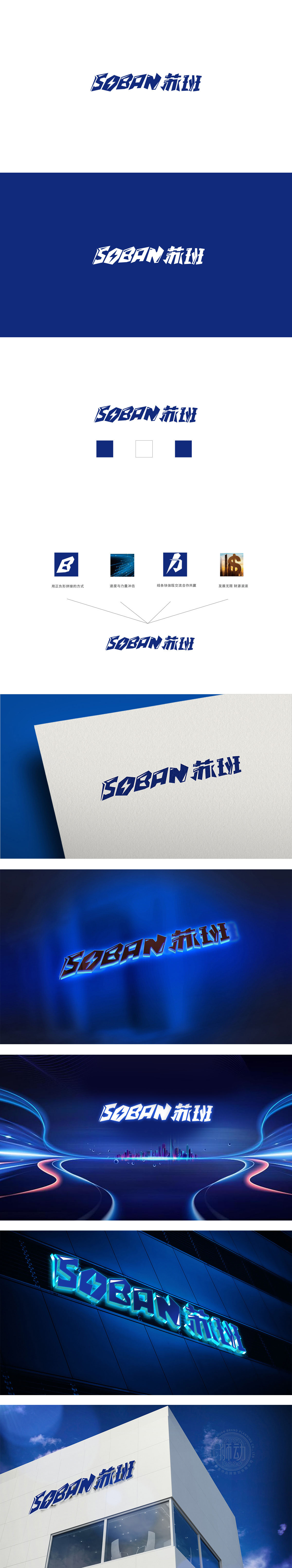
狮动设计采用硬棱角+几何切割的字体风格:“S”的斜切线条、“O”内部的横线、“B”“A”的锐角处理,都像家电产品的“工业设计细节”,传递出“专业制造”的严谨感;“苏”“班”的笔画被简化为紧凑的矩形与斜线组合,结构方正却不呆板,符合家电品牌“简洁易用”的用户认知。棱角与几何感,契合家电的“专业与科技”属性。整体传递出“科技感、可靠性、现代感”的品牌属性。
Lion design adopts the font style of hard edges and corners+geometric cutting: the diagonal lines of "S", the horizontal lines of "O" and the acute angles of "B" and "A" are all like the "industrial design details" of household appliances, conveying the rigor of "professional manufacturing"; The strokes of "Su" and "Ban" are simplified into a compact combination of rectangles and diagonal lines, but the structure is square but not rigid, which conforms to the user's cognition of "simplicity and ease of use" of home appliance brands. Angular and geometric sense.


扫码或拨打添加客服微信


