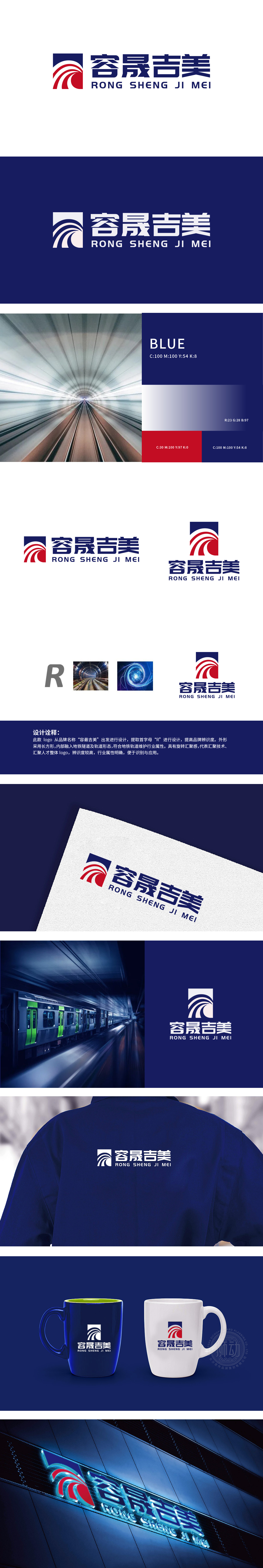
狮动设计采用首字母「R」的变形,外框是「隧道」的隐喻:长方形的「R」外框,特意做了「向内部延伸」的纵深感处理,像极了地铁隧道入口的透视效果——这种「代入感」,直接把品牌与「地铁轨道」的行业场景绑定,用户看到的瞬间,就能联想到「地下空间、轨道系统」的核心场景。还有那“旋转汇聚”的动态感,像技术的洪流、像人才的聚集,每一根线条都在“动”,每一根线条都在说:“我们是地铁轨道的‘守业者’,我们聚起所有力量,护着这条‘地下脉络’。整体设计用最极简的元素,敲开了“地铁轨道维护”的行业认知密码,让品牌一亮相就“自带行业身份”,让用户一看到就“瞬间get核心价值”。
Lion Design transforms the initial letter "R", and the outer frame is a metaphor of "tunnel": the rectangular "R" outer frame is specially treated with a sense of depth, which is very similar to the perspective effect of the subway tunnel entrance-this "sense of substitution" directly binds the brand to the industry scene of "subway track", and the moment users see it, they can associate it with "underground space". There is also the dynamic sense of "rotating convergence", like the torrent of technology and the gathering of talents. Every line is "moving" and every line is saying: "We are the defenders of the subway track, and we gather all our strength to protect this" underground vein ".


扫码或拨打添加客服微信


